The Problem:
Nowadays, we can find photography guides which work interactively, but they are restricted to teach only some essential technical characteristics of a digital camera. What I would like to add in this field is to represent the rules of composing a beautiful portrait and forming one’s style as well. My goal through my design is for the user, who is a beginner, to gain the necessary knowledge for creating a compelling portrait.
The Solution:
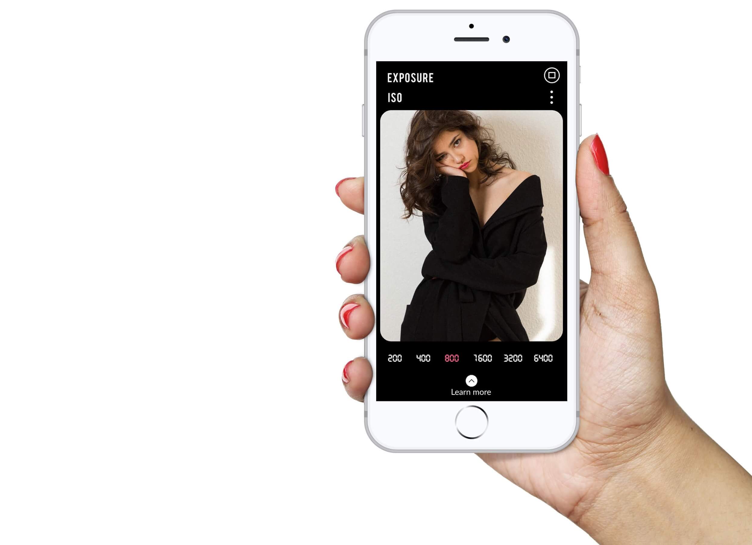
The end product is a mobile app for all those who would like to gain knowledge about how to capture beautiful portraits, through practical and theoretical guidelines, and how to form their distinctive photography style. Through research so far, I conclude to the fact that a mobile application would be the best choice as researchers show us that today most people interact through mobile apps.
Wireframes
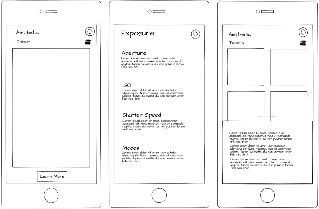
The method that I follow to see how my idea could work was to proceed to wireframing. Wireframing is the most crucial step in designing an app, either for your mobile or for the desktop. Wireframing is the process when you either sketch on the paper your ideas or a wireframe tool. It is a static, low-fidelity, low-cost, and low-energy representation of the product and at the same time, it is a basic guideline of the skeletal framework for both, the design and the development stages..
So, for this project now, it is the time to map out the priority of content. This process, through trials and errors, leads me to the right level. By using a grayscale color scheme, lines and boxes that aim to represent the positioning and levels of visual hierarchy in the design, you can have a 1st look and impression on my practical part of this dissertation.
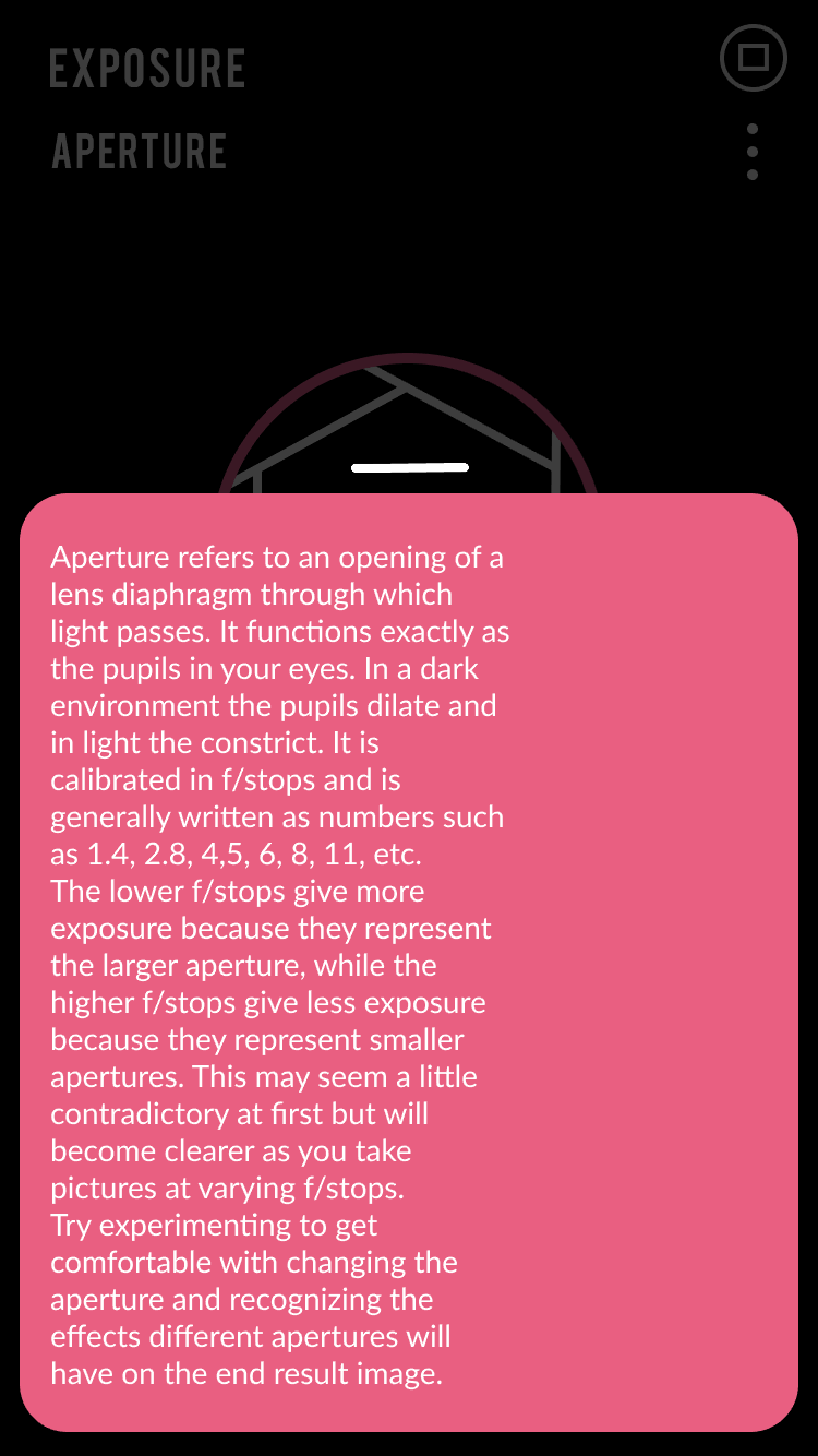
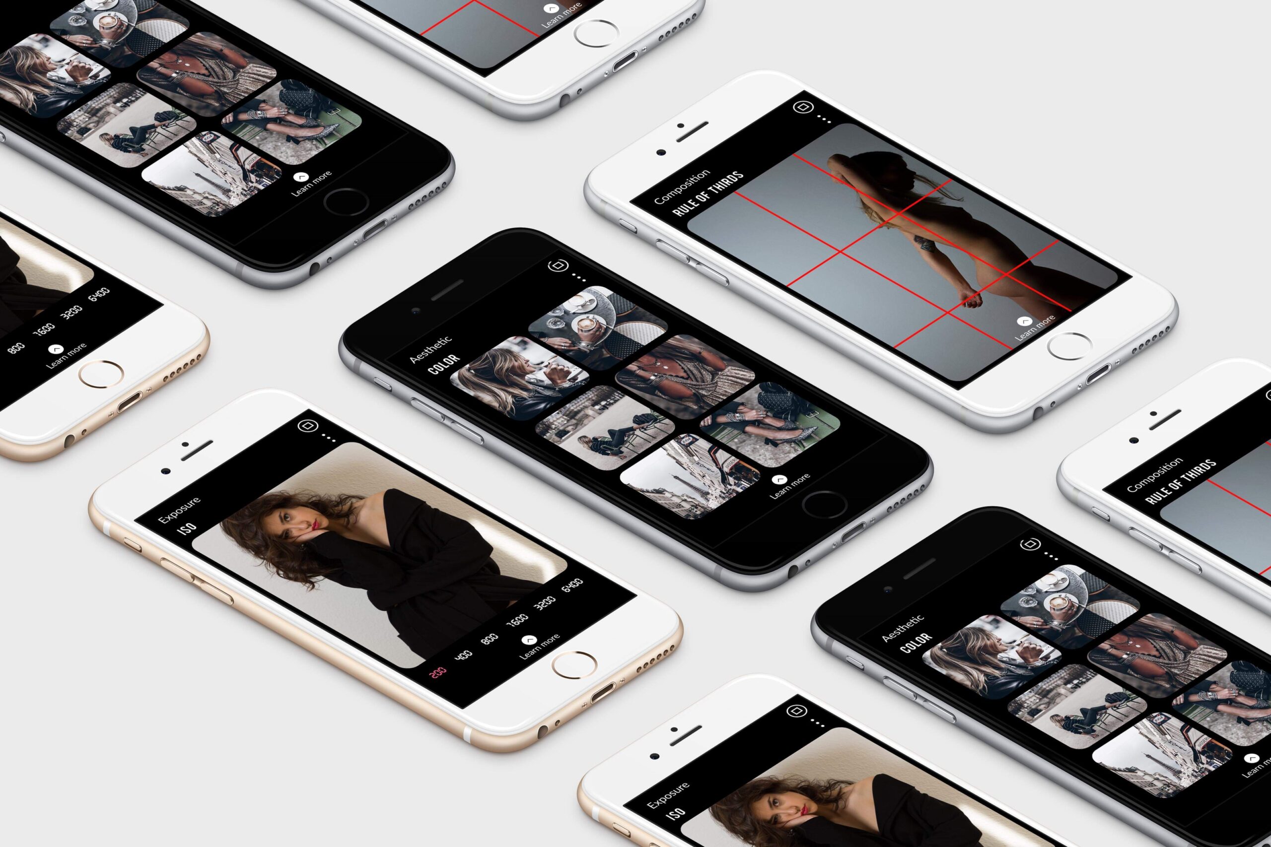
As the users don’t read pages, but they scan them, I created very minimalistic artboards which consist of a photograph or sets of photographs and only three basic elements inside: the chapter that indicates where you are, the subchapter you are seeing, and a CTA button on the bottom of the artboard, which calls you to tap if you want to gain more in depth knowledge.
Name
I spend a lot of time brainstorming about a catchy name for my app. To be honest, I had many different bad ideas such as Photo-sign, Pho-si, Depho(to) Tepho, blow up, master shoot, PhotoX, etc. But, as you may know, the best ideas coming after a while, under the shower and along with a productive discussion with your team. So finally the name of my app is “Focus.” I thought that by using a word or orology of the field of photography would be a key to success.

Colour
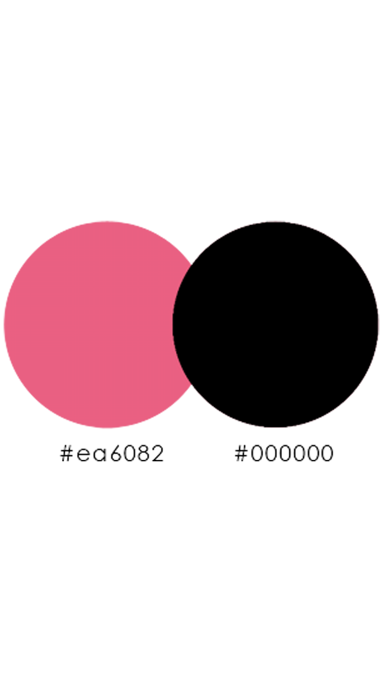
For the colors, I used my two favorites. Pink and Black. Black is working well as a primary color for the background of my artboards. On the blackboard, the photographs attract the attention of the viewer, because the contrast in between a colorful picture and the black background is high. Also, the black color gives a luxurious and chic aesthetic to my mobile app.
I used the pink color for the artboards, which contain text. I use the pink color not as font color, but as a background color to highlight my text. I can see that by using such color the monotony breaks. (Michael J. Nolan,2011)dge.
Key Features
The key features of this app for beginner photographers are:
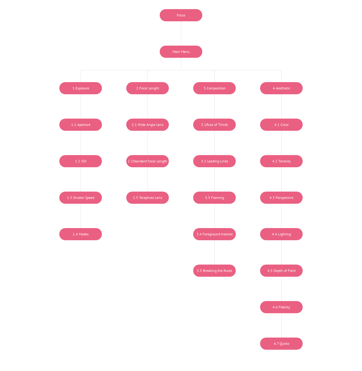
- The Focal Length, which consists of three subchapters (wide angle lens, standard and telephoto lens) and informs you about the functionality of the lenses in each different case.
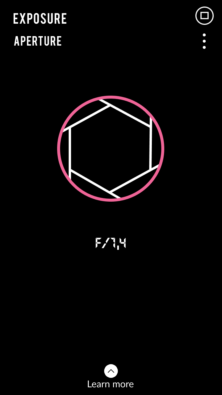
- The exposure which consists of four subchapters (aperture, Iso, Shutter speed) and gives you knowledge about brightening or darken your image.
- The composition which comprises of five subchapters, (rule of thirds, leading lines, frame, foreground interest, breaking the rules and help you to learn how to create well-composed, balanced, and attractive images.
- The aesthetic, which consists of seven subchapters (color, tonality, fidelity, lighting, quirks, Depth of field, and perspective) and guide you to build your style as a photographer.
Navigation Flows
Personas
The more constructive stage of all was the testing of my prototype with real users.
This is how I allowed myself to go on a higher and to create something usable and stylish. It is that moment when you try to see how your design could work in relation with a potential user before the creative process, which choices you give to your user, what exactly you want from this app to do and until where you want this app to reach. The prototyping is a mid-to-high-fidelity design model of the final UI (User Interface) of my application.
Don’t make me think!
Creating personas helped me make decisions about content priority, usability, consistency, and to speak the user’s language. S.Krug (2014, p.25). As with this project, I address to people from fifteen to fifty years old, the personas that I chose for the usability test are 28 and 35.
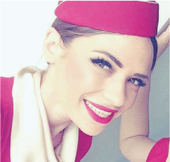
Name: Evi
Age:28
Location: Thessaloniki
Occupation: Cabin Crew
Tech savvy, uses a variety of mobile apps,
Including Instagram.
Evi is working as a cabin crew. She is traveling a lot, and she wants to collect moments from her destinations. She is a lover of Instagram, and she is trying to improve her photos. When I talked with her about my app, she got enthusiastic because she wants to learn more about composition and aesthetic. Her main problem is how to achieve consistency and how to place people or even herself into the picture.
The problem with Evi that I realized was that she was swiping all the time on the screen either left or right and up and down. Since that moment, I had enabled only the “tap” way of going to the next artboard, and the area for the finger to tap the desired point of the screen was restricted.
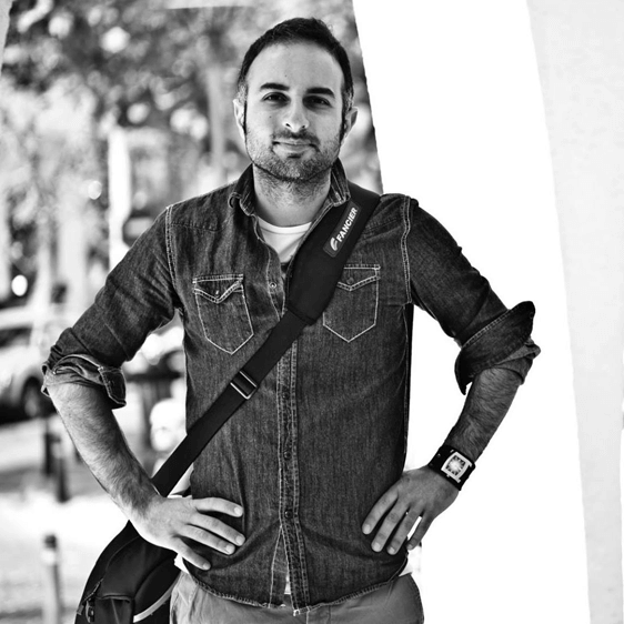
Name: Anestis
Age: 35
Location: Thessaloniki
Occupation: Professor
Tech Ability: Tech-savvy; keeps up
With what’s new in photo and video production.
Anestis is a professor of video production for the Metropolitan College of Thessaloniki. He is 35 years old, and he is always curious about new trends of technology in combination with teaching.
The problem with Anestis was more content wise. He wanted to see more pictures and more detailed explanations. In the beginning, my descriptions were as shorter as possible, and I had put them on the same screen with the image. Then I changed this. I placed pictures and text separately. Also, I used in-depth explanations.


