The problem
Paper forms that nobody read — and handoff friction that slowed every consultation
Every Patient21 clinic used paper-based intake forms for first-time patients. Patients filled them in the waiting room. The forms were dense, medical in language, and frequently incomplete. Nurses then manually transcribed relevant information into the practice management system before the consultation.
The result: a 10-15 minute administrative overhead per new patient, a data quality problem (handwritten entries, missing fields, illegible responses), and a consultation that began with the doctor playing catch-up on basic patient history rather than engaging with the actual presenting concern.
"By the time I've found what I actually need from the form, the patient has been sitting there for three minutes while I read. That's not how a consultation should start."
— GP, Patient21 Munich clinic
Design constraints
Speed in clinic, accuracy at handoff — for patients across a wide age range
The digital anamnesis had to work on the clinic's tablet hardware (shared iPads, not personal devices). It had to be completable by patients aged 16–80 in the waiting room, with no onboarding or instruction — just open and fill. Completion time had to be under 5 minutes for a standard intake, under 8 minutes for a comprehensive anamnesis.
On the clinical side: the output had to be structured in a way that surfaced the most relevant information at the top of the consultation view — not a dump of form answers, but a prioritized clinical summary. This was a design problem as much as a data problem.
Approach
Conditional logic, plain language, and a clinical summary that writes itself
The form was redesigned as an adaptive flow — not a static set of questions. Initial questions (reason for visit, age, known conditions) determined which subsequent sections appeared. A patient visiting for a cold got a short respiratory intake. A patient with diabetes got the extended chronic condition section. This reduced average form length by 40% while maintaining clinical completeness for complex cases.
Every question was rewritten in plain language — tested with patients across age groups in Maze. Medical terminology was eliminated except where it was genuinely the most natural phrasing (most patients know "asthma" better than a plain-language description).
The output to the practice management system was structured, not freetext — each response mapped to a clinical data field, enabling the consultation view to auto-populate a summary: "First visit. Reason: sore throat. No known allergies. No current medications."
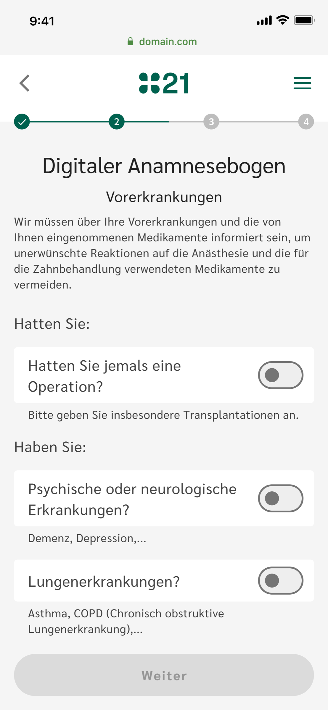
Patient flow · mobile
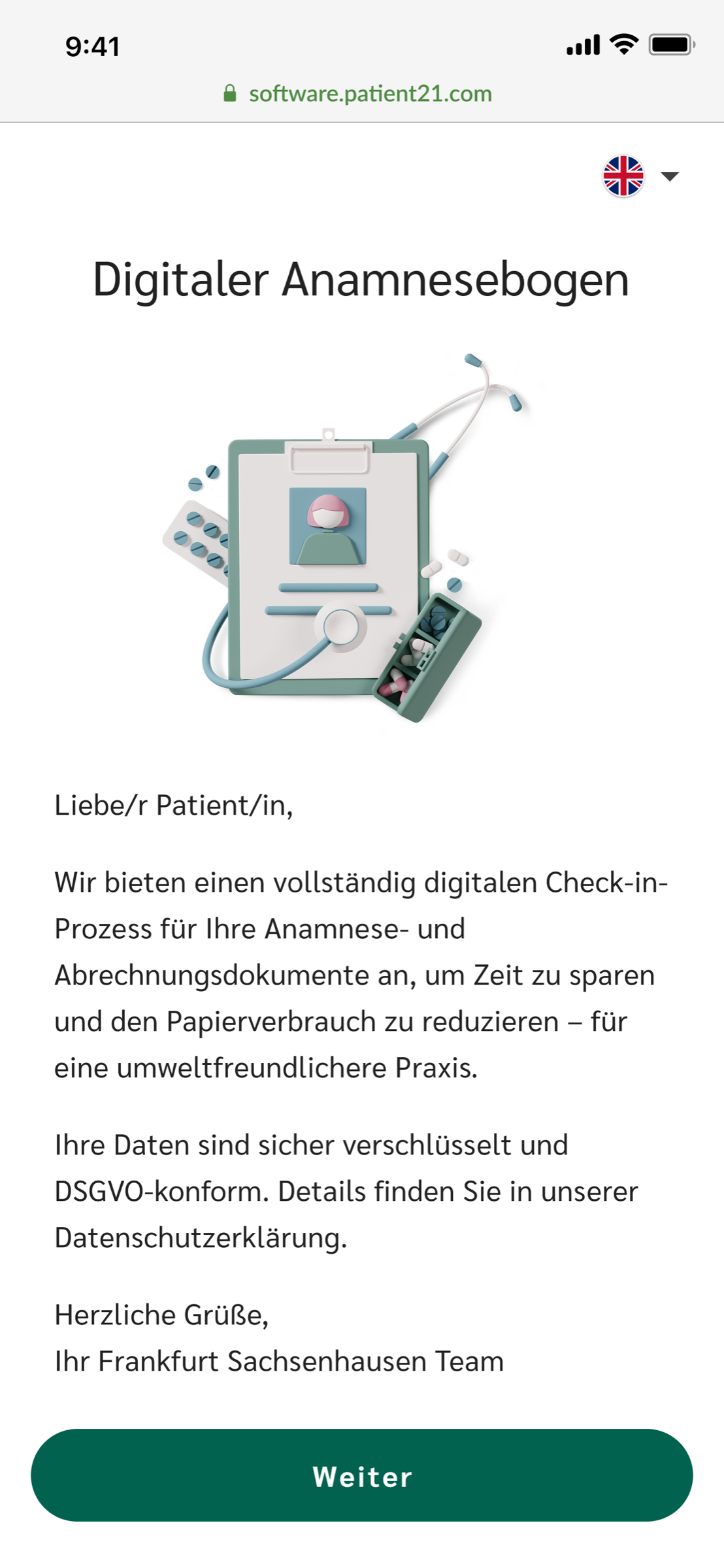
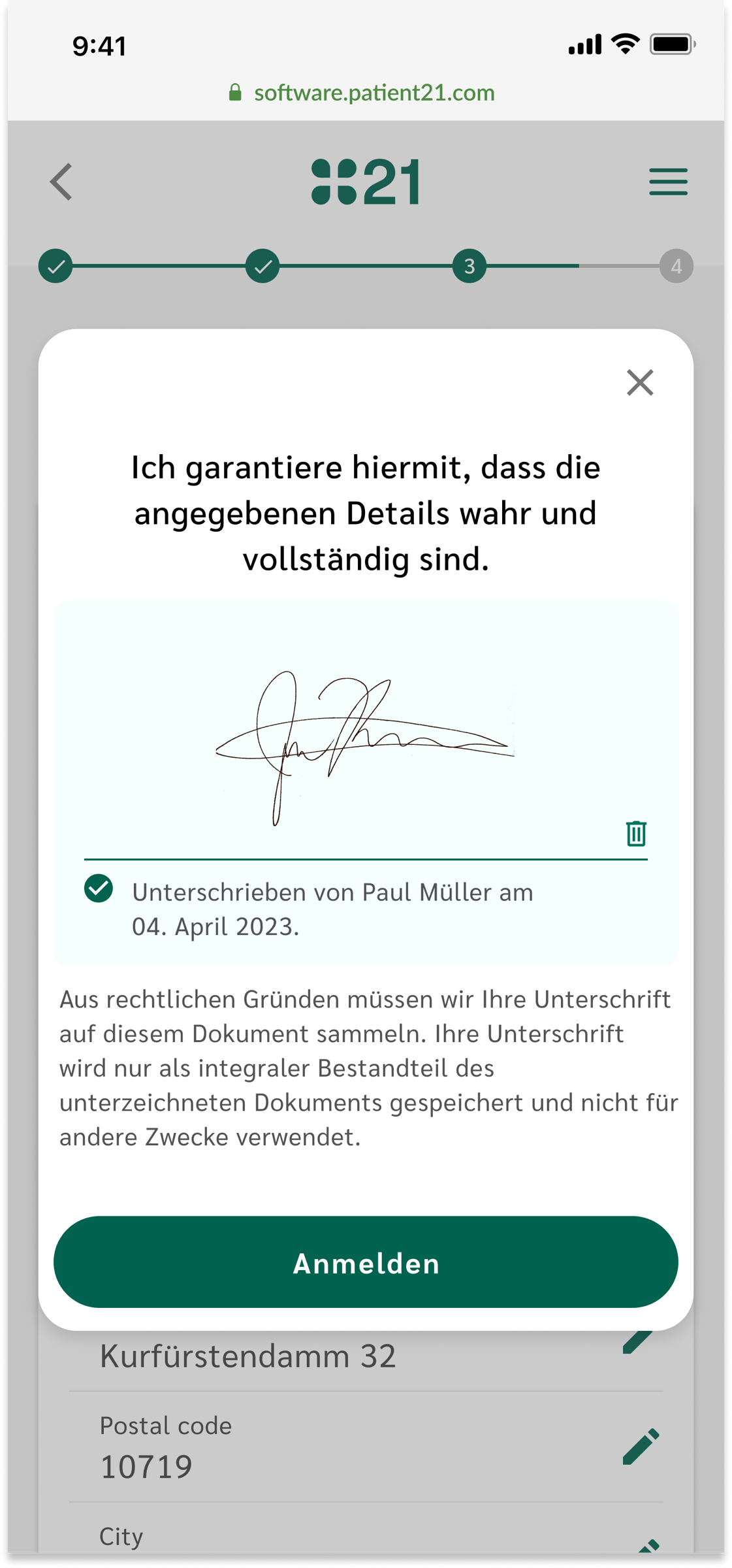
From the SMS link to the signed form, on the patient's own phone.
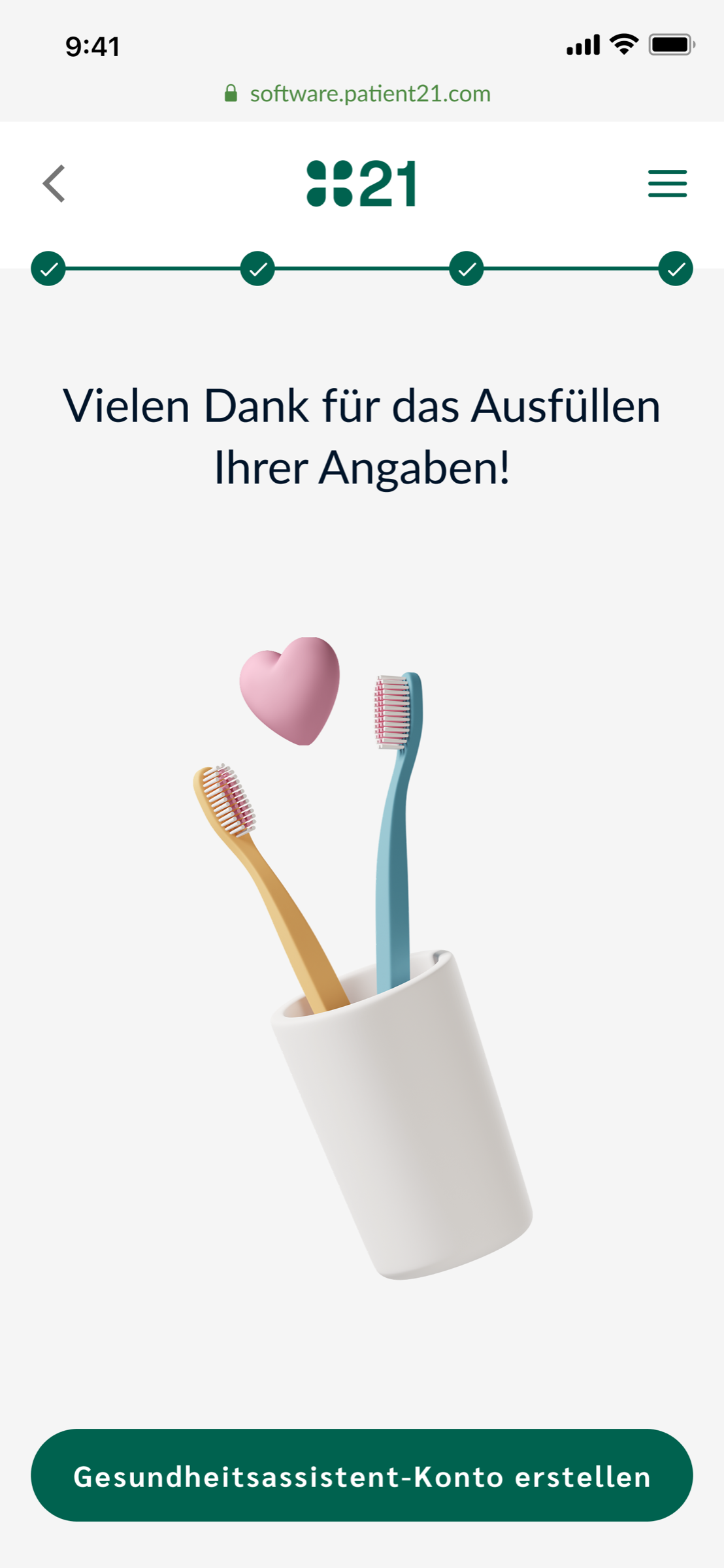
A quiet welcome screen sets context (who the form is for, why it matters, that data is encrypted). Sections are short and progressive — only what this patient needs. The signature is captured in-flow, not as a separate paper step. The hand-off screen closes the loop and offers an account, optional and on the patient's terms.
Clinic flow · shared iPad
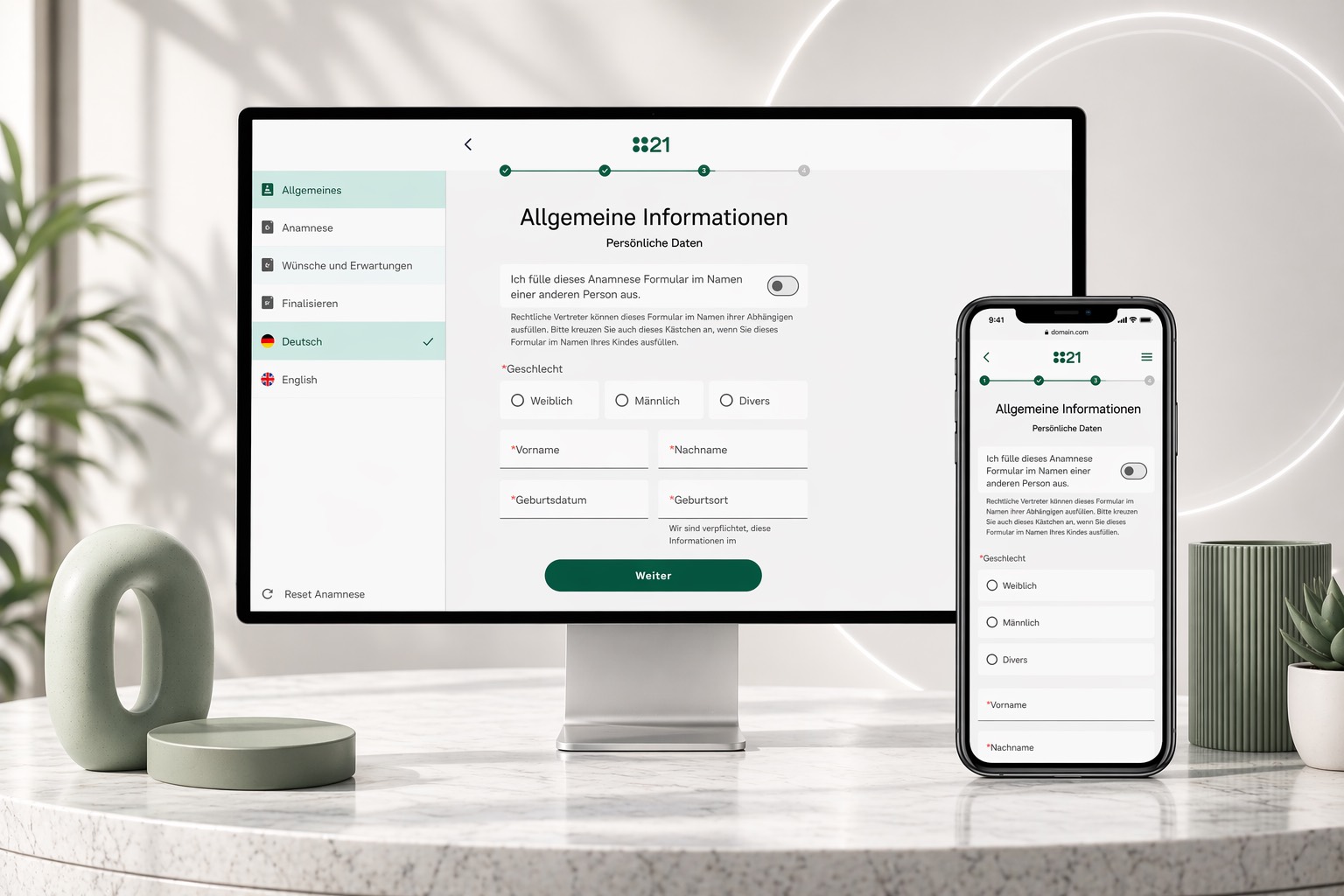
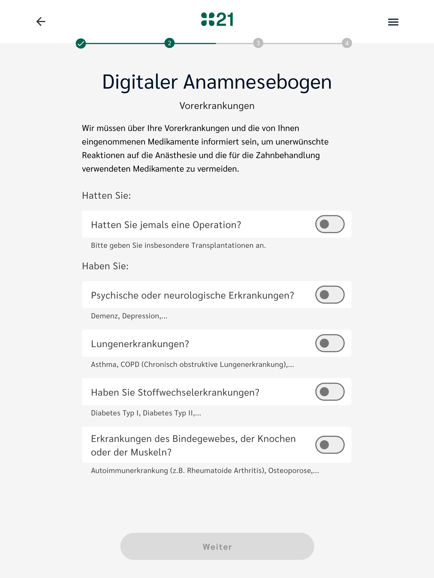
The same form, restaged for the waiting-room iPad — wider, calmer, more white space.
The tablet layout treats the form as a quiet reading surface, not a dense web form. Toggle answers stay where the thumb is, larger touch targets, generous spacing — designed for a shared device handed across the front desk.
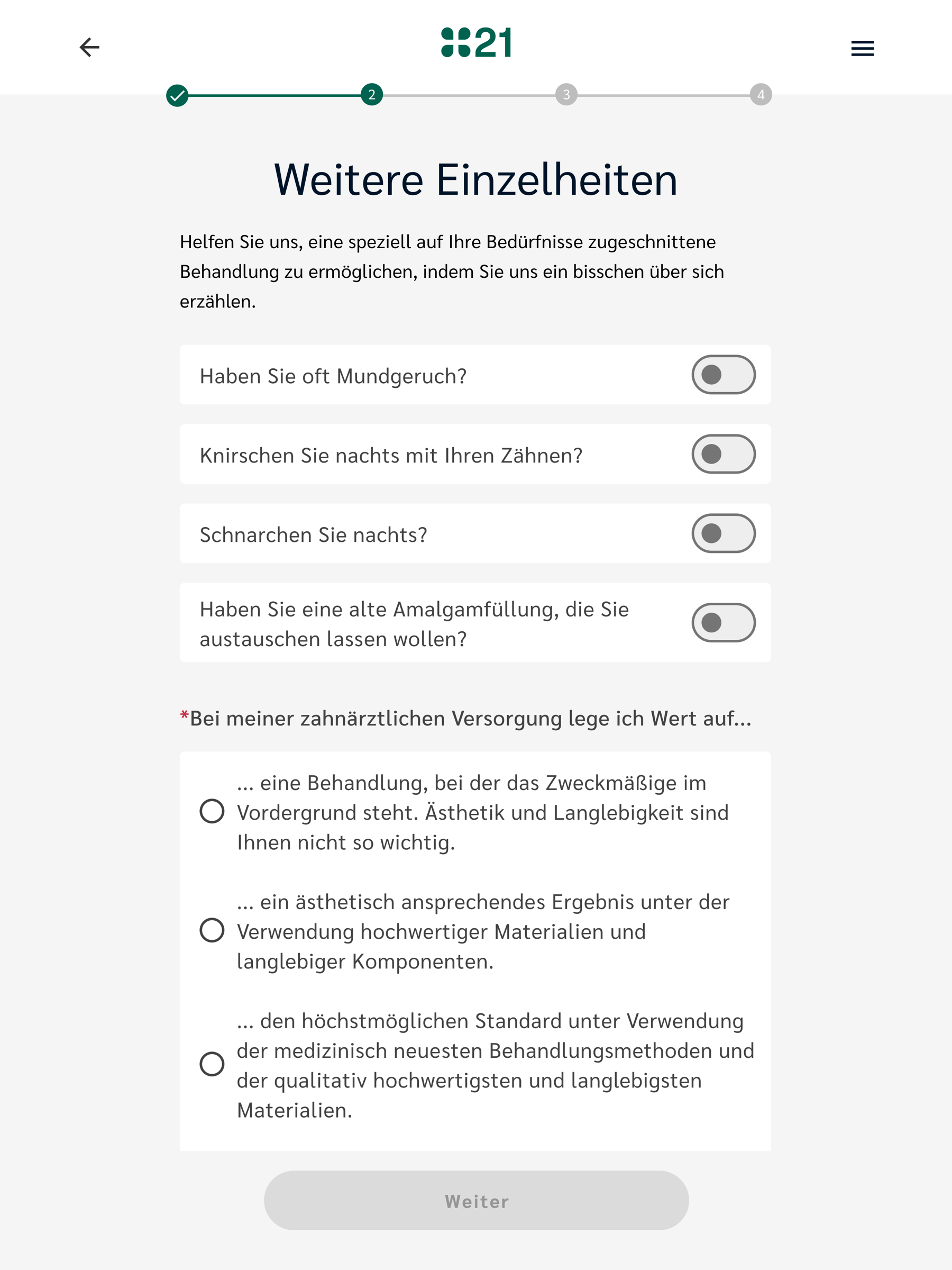
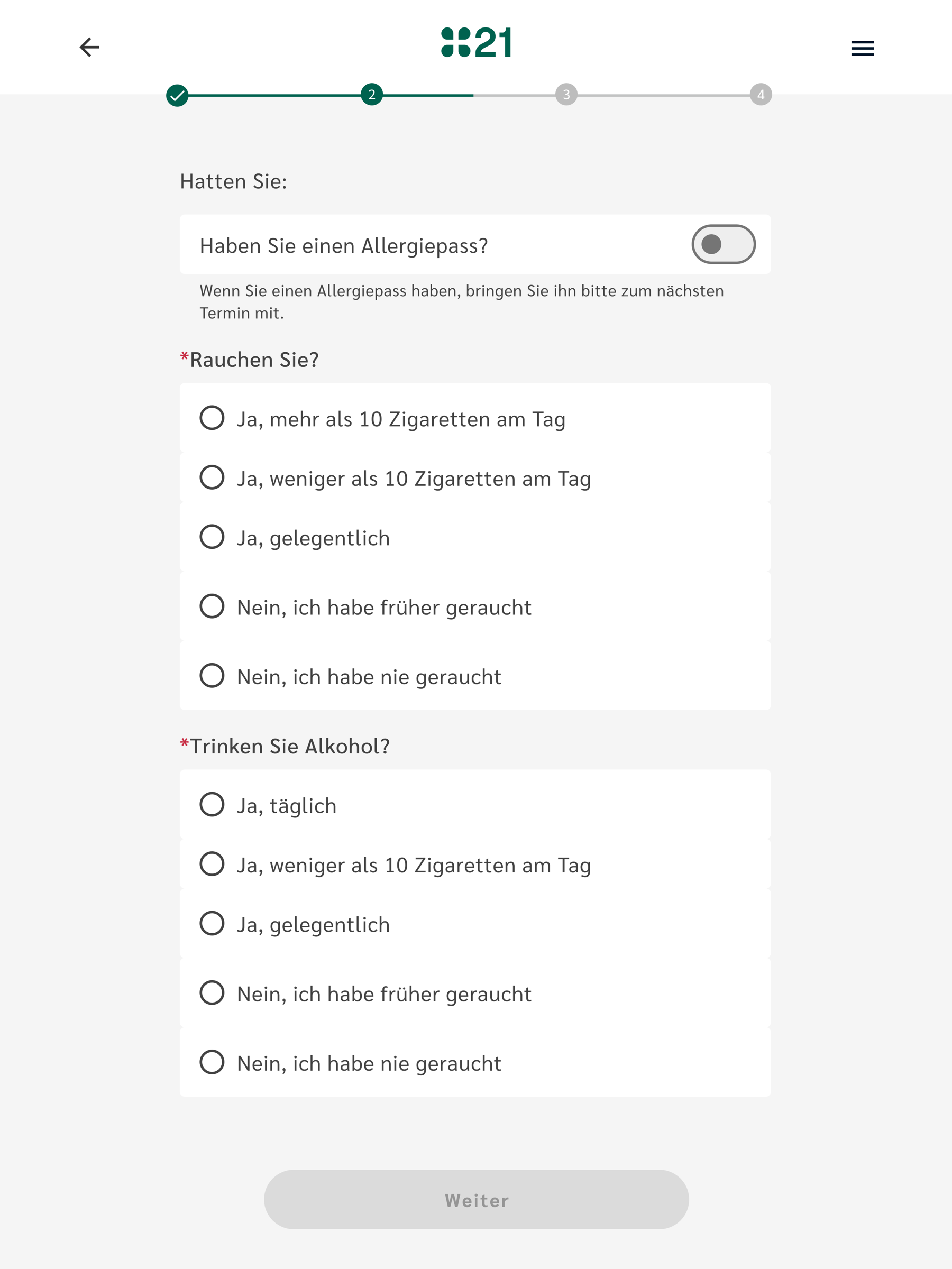
Clinic flow · choice density
When the answers branch, the form lets them — without losing the thread.
Lifestyle and habit questions need real granularity. Five-option radios stay legible on a shared iPad; required-field signals are quiet but unmissable. The progress bar hides the total step count — no patient should ever feel they're at "step 4 of 23."
Closing the loop
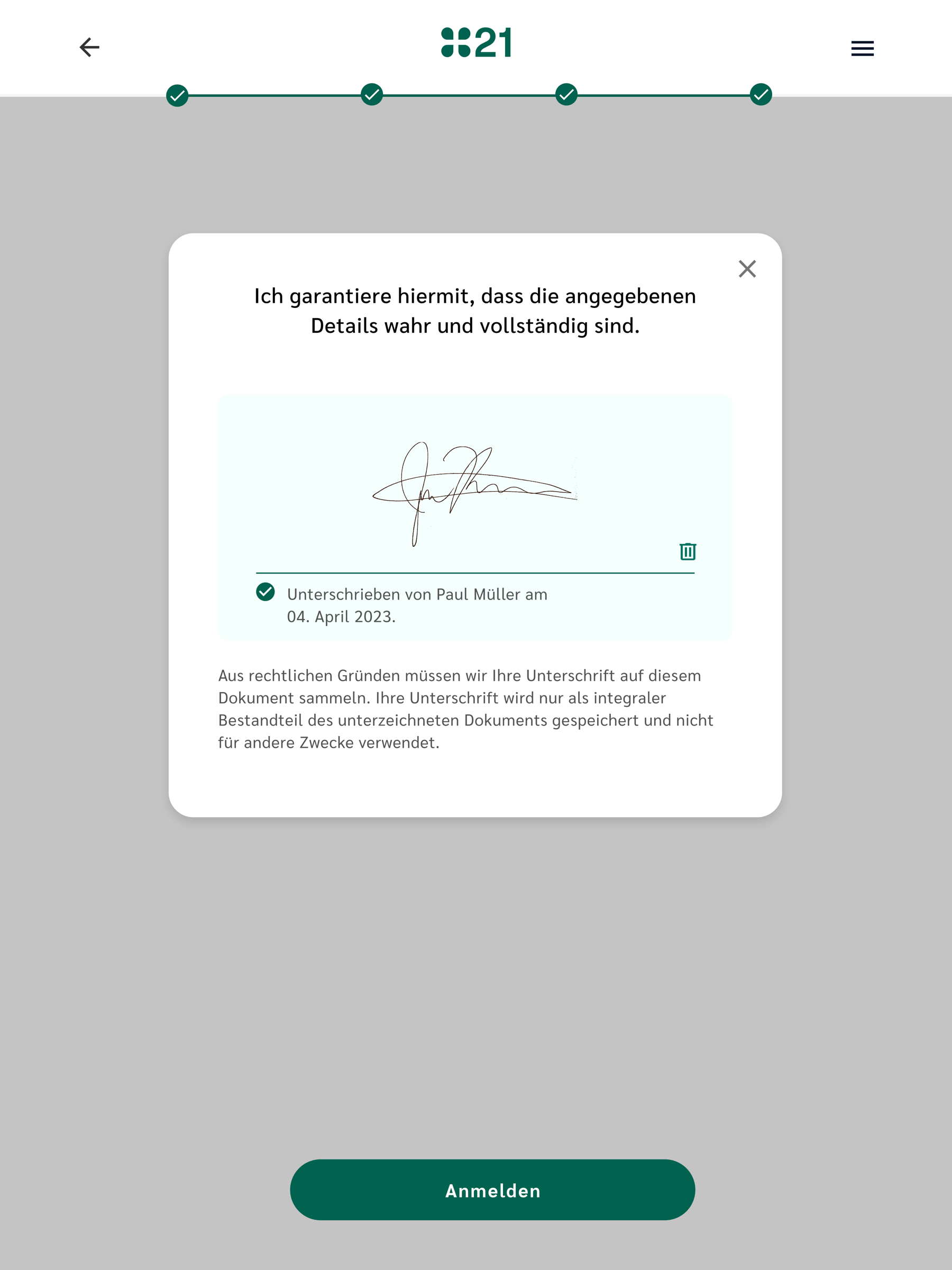
A wishes-and-expectations step — and a signed acknowledgement that the patient knows what's been entered.
Two final screens make the digital form feel as legitimate as the paper one it replaces: a free-text "wishes and expectations" prompt that lets the patient speak in their own words, and a signed acknowledgement panel that confirms the data is theirs.
Form design decisions
- Adaptive flow: question sets determined by initial responses, not fixed sections
- Large tap targets optimized for shared tablet use (16px minimum inputs replaced with 48px touch targets)
- Progress indicator: patients see how far through they are without knowing the total steps
- Plain language throughout — validated with 40+ patient testers
Clinical output decisions
- Structured data, not freetext — every answer maps to a defined field
- Priority summary at top of consultation view: reason, allergies, medications
- Full responses available on demand — accessible without cluttering the summary
- Red-flag highlighting: critical responses (known anaphylaxis, active symptoms) surfaced immediately
Outcomes
Manual transcription eliminated, consultation start time improved
Post-launch measurement across pilot clinics showed that manual transcription was effectively eliminated for standard intake scenarios. The administrative overhead per new patient dropped from 10-15 minutes to under 2 minutes (account setup and confirmation).
Clinician feedback on the summary view was strongly positive — the prioritized summary reduced the "catch-up" phase at the start of consultations. Data quality improved measurably: structured fields with controlled inputs meant no more missing or illegible responses for critical fields like medication lists and allergies.
Completion rate for the digital form was 94% — significantly higher than paper form completion, which averaged around 70% for all fields.