Here I would like to talk about a fully integrated and interoperable product suite, that digitalizes the patient-clinic-network operator journey end-to-end.
Understanding the challenges in modern dental practice management
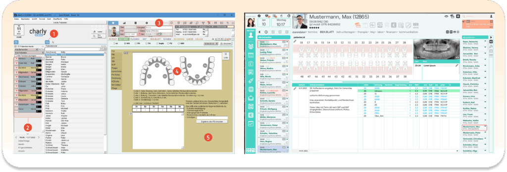
💔 Screenshots from different Practice Management Systems in the market show outdated interfaces and poor user experience.
The journey started in 2020. While operating their dental clinics, Dental 21, the company i’m working for, found some major bottlenecks. To begin with, every dental clinic has a central piece of software, called Practice Management System (PMS). The market is dominated by legacy PMSs, as vendors lock in their customers by making it deliberately difficult to change. The typical software setup of a clinic consists of: Practice Management System (PMS) and some purpose specific softwares such as online booking, CRM etc. The problem here is that these softwares are all old or so independent that the automated information exchange between the systems is not possible, or in some cases is limited. Therefore proper data exchange requires high manual effort.
Example problem:
Patient books online | Receptionist manually copies data | Transfers to PMS | Creates Invoice
This process wastes valuable time and introduces human errors.
My Methodology
A comprehensive approach to solving complex healthcare software challenges
Research & Analysis
Looking at market examples and existing software (like Charly, Solutio, and Claire), we collaborated extensively with Product managers, clinical staff, and developers during the research phase. We decided to acquire Claire as a company and enhance it.
Research & Analysis
Looking at market examples and existing software (like Charly, Solutio, and Claire), we collaborated extensively with Product managers, clinical staff, and developers during the research phase. We decided to acquire Claire as a company and enhance it.
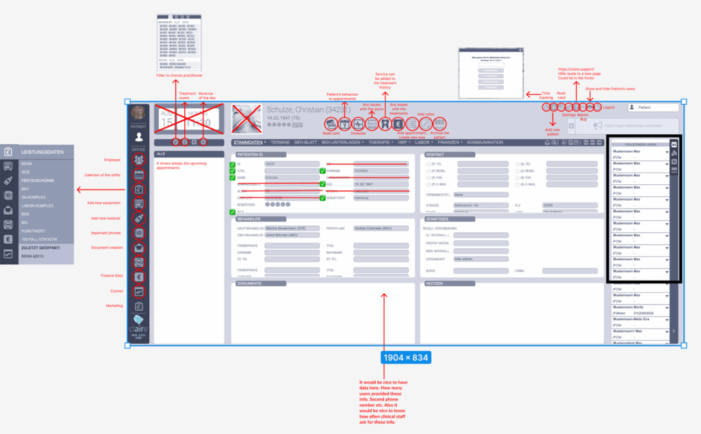
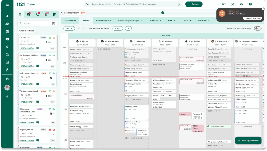
Complete Frontend Overhaul
The project required a methodical approach: refining input fields, optimizing search bars, enhancing menus, adjusting clickable areas, and redesigning overlays. I worked step by step, component by component, testing each feature through real-world scenarios.
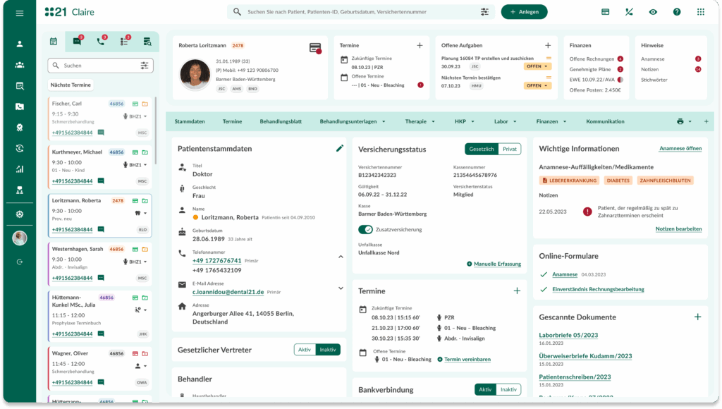
From this
To this
Examples of Components
Detailed component design focusing on accessibility and user experience
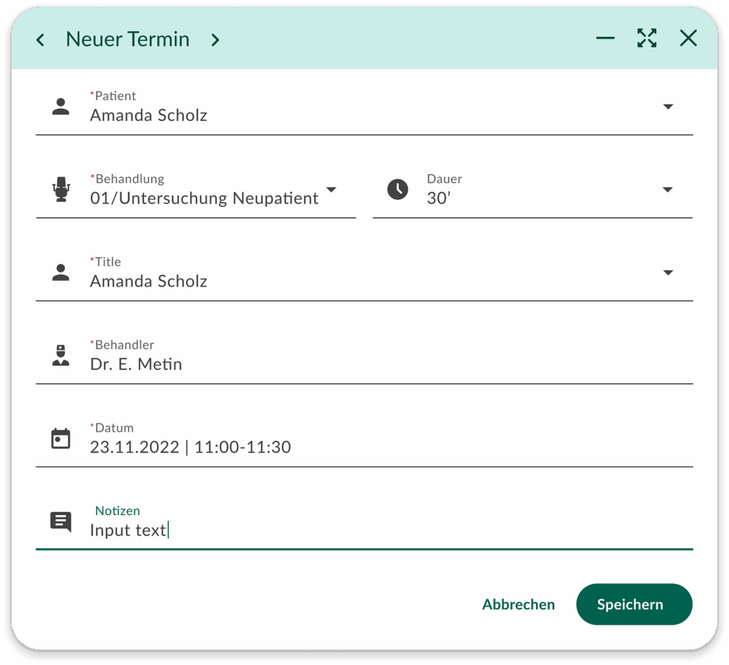
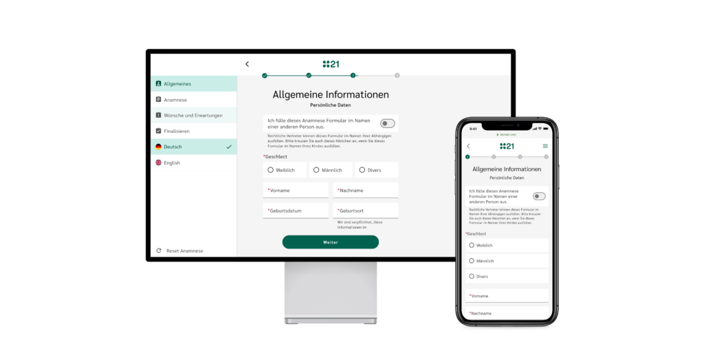
Modals
I used modals to focus user attention and facilitate critical interactions. In product design, modals temporarily interrupt the main workflow to deliver key information, gather user input, or prompt decisions. They appear as overlay windows, allowing users to either proceed with a specified action or dismiss the modal to return to the underlying content. The design of modals emphasizes clarity, keeping the content compact and ensuring easy navigation with clear call-to-action buttons. Accessibility is prioritized, supporting keyboard navigation and screen reader compatibility to enhance user experience for all individuals. By leveraging modals thoughtfully, we aim to provide a seamless and intuitive interactive experience.
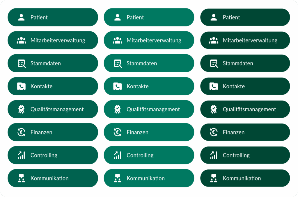
Buttons
In designing accessible buttons for products, I focus on several key elements to ensure usability for everyone:
Size and Shape. I make sure buttons are large enough, so they’re easy to tap or click. Rounded edges are my go-to for a touch-friendly design.
Color Contrast. I always choose colours with high contrast between text and background, aiming for at least a 4.5:1 ratio. This is crucial for users with visual impairments.
Text and Icons. Clear, concise text or universally recognised icons are essential.
Keyboard Navigation. I prioritise making buttons keyboard-friendly, allowing navigation with the Tab key and activation with Enter or Space
Focus Indicators. A visual indicator for focused buttons is non-negotiable. It helps users track their navigation within the interface.
Disable States. I clearly denote disabled buttons both in color and with text cues like “Save” versus “Saving…”.
By incorporating these elements, I aim to design inclusive interfaces that everyone can use with ease.
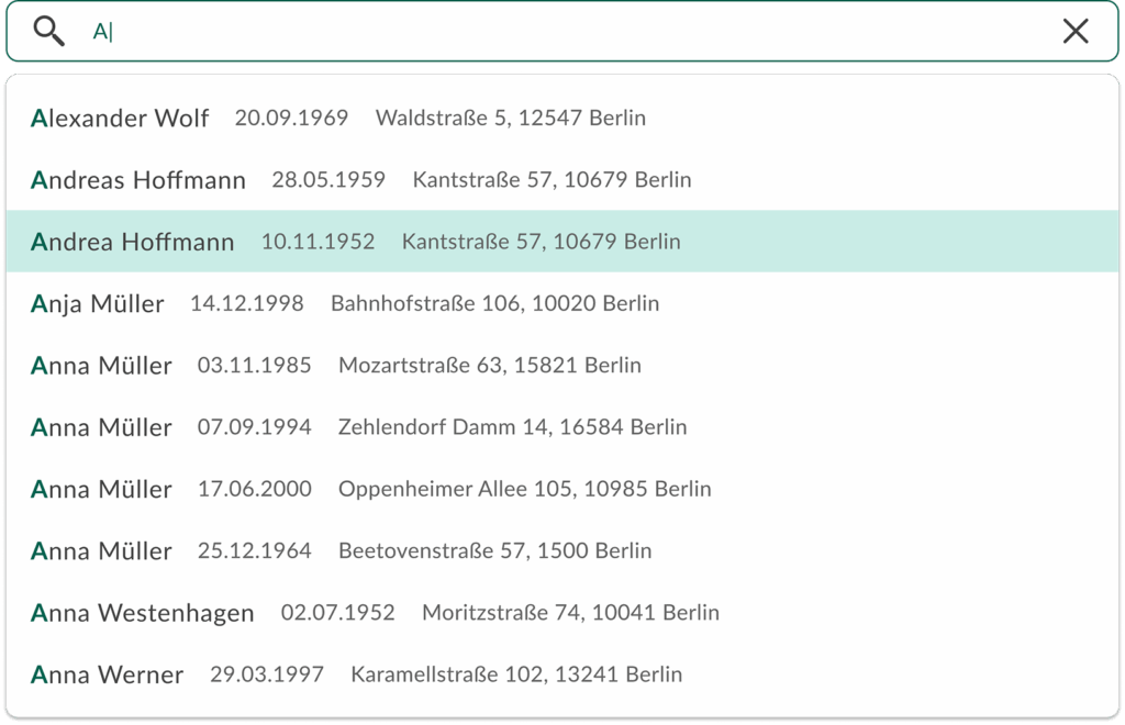
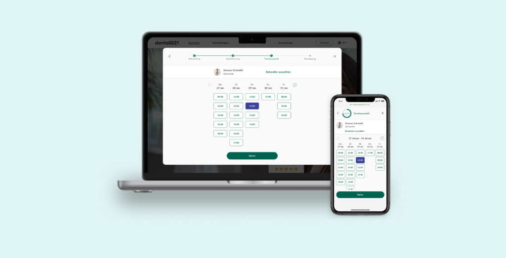
Search bar
Designed specifically for efficiency, receptionists can quickly locate and access the correct patient data even while on the phone, streamlining communication and patient care.
The key features include:
Minimalist Design: clean appearance
Alphabetical & Relevant Sorting: Displays search results by alphabetical order with essential details like date of birth and address, enabling rapid identification.
Smart Suggestions: As users type, relevant results appear to minimise effort.
Responsive & Adaptive: Ensures optimal usability across all devices and platforms
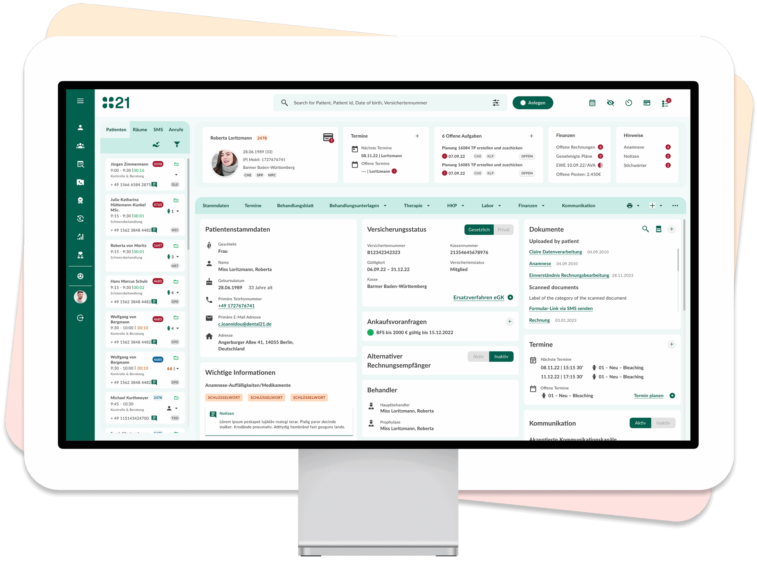
The solution
Our solution adheres to all regulatory standards, accommodating various billing types (private and public) and integrating with the German Healthcare Network (Telematik Infrastructure).
Comprehensive management of practice resources, including patients, appointments, rooms, and hardware
Automated generation and electronic submission of treatment plans
Detailed documentation of medical services and billing processes
Interfaces with hardware, like X-ray machines, and factoring firms
AI-powered capabilities such as voice-controlled treatment documentation (Medlog), detection of caries from X-ray imagery, and billing assistance
This ensures efficient and compliant operations within the healthcare facility.
More Case Studies
Explore other product and UX projects that showcase strategic thinking and measurable impact