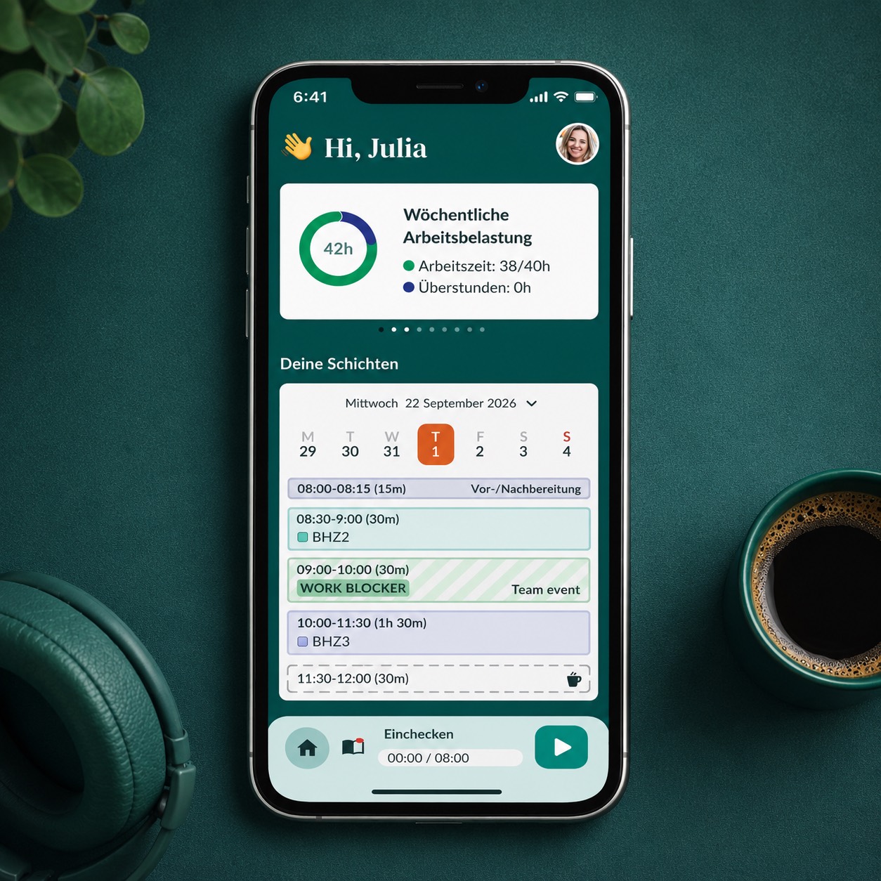
Context
A pocket tool for the people who keep the clinic running
Dental practice staff — assistants, hygienists, front-desk, and rotating clinicians — were tracking shifts, hours, and check-ins on paper or via the desktop practice management software. Neither worked on the move. The Clinician App was designed as a mobile-first companion: open it before a shift, glance at the week, check in, log overtime, get back to work.
Core surfaces
One-tap actions, calm visuals, no clinical clutter.
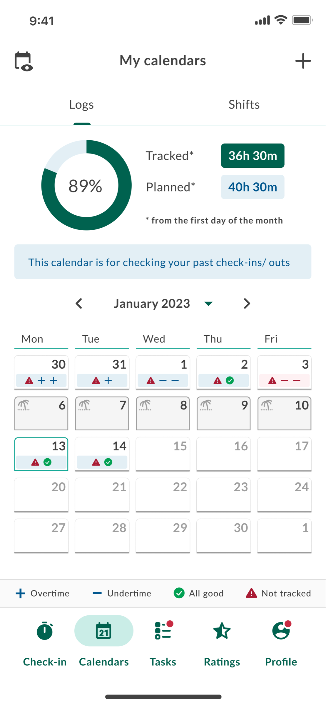
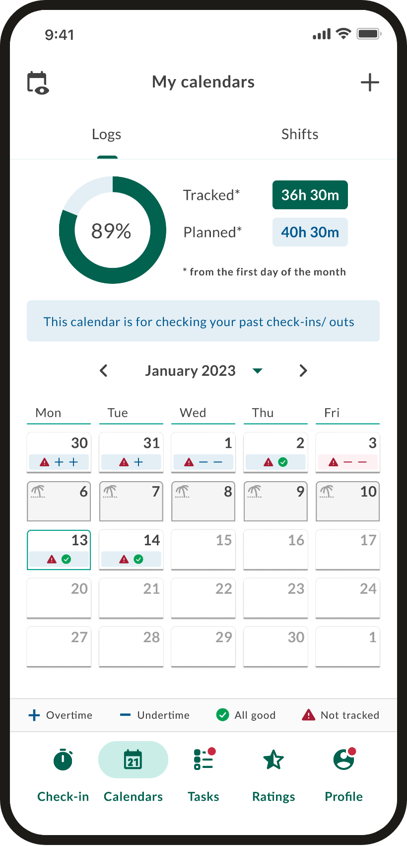
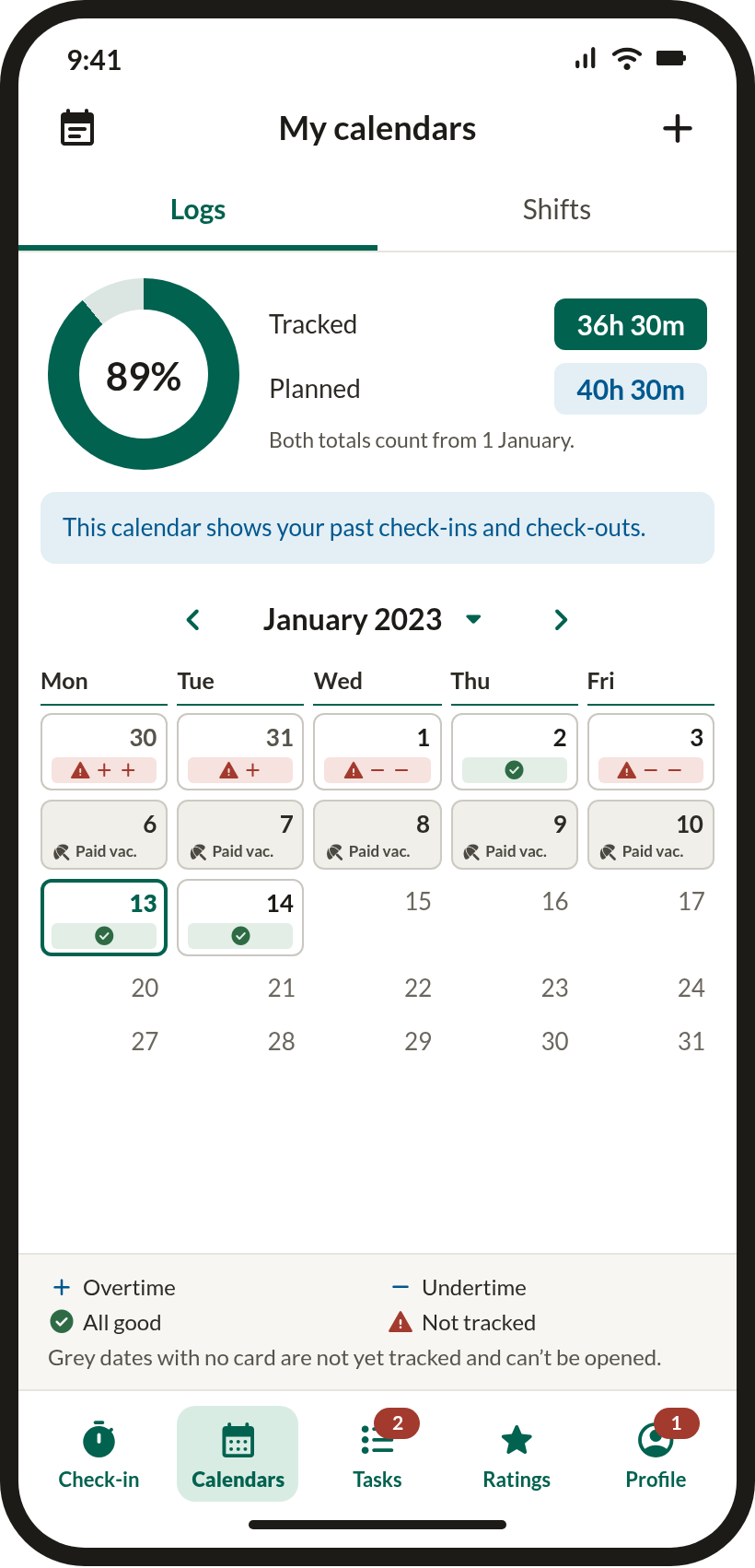
My calendars · hours tracked
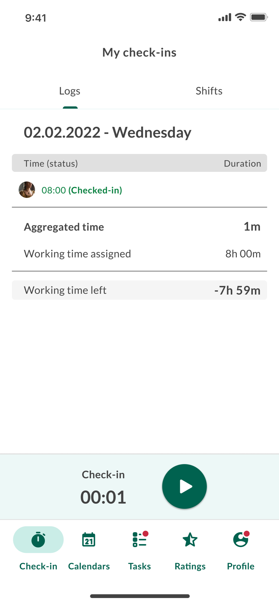
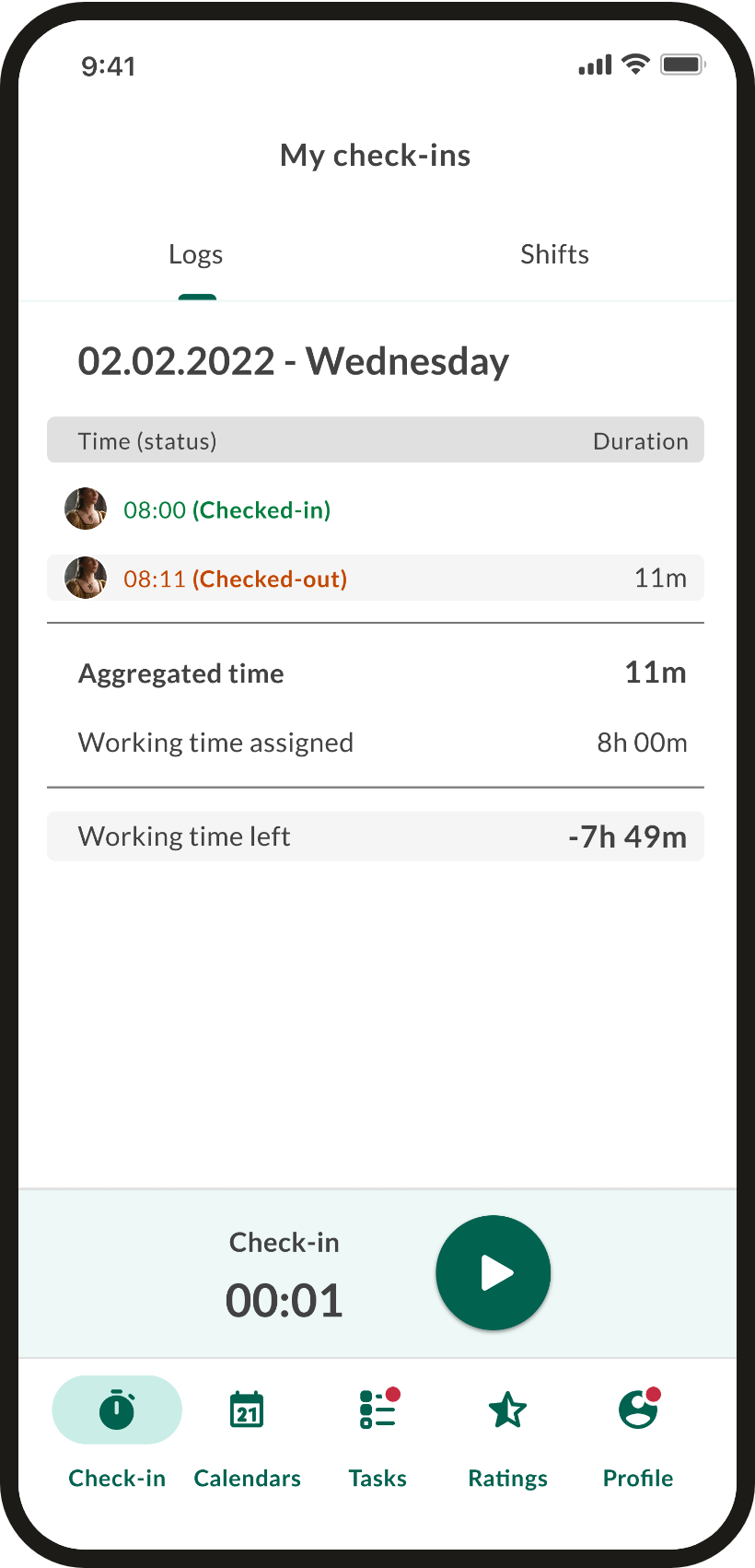
Check-in · daily timer
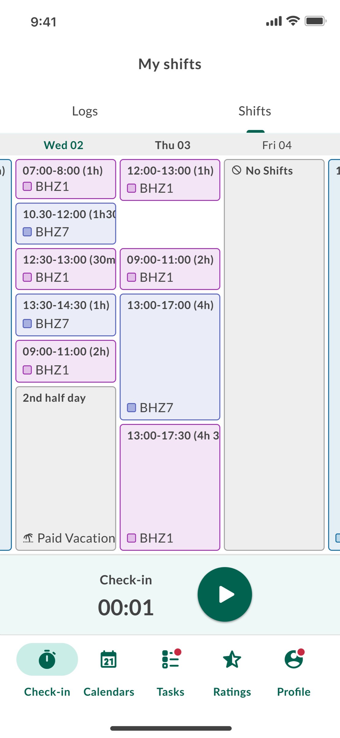
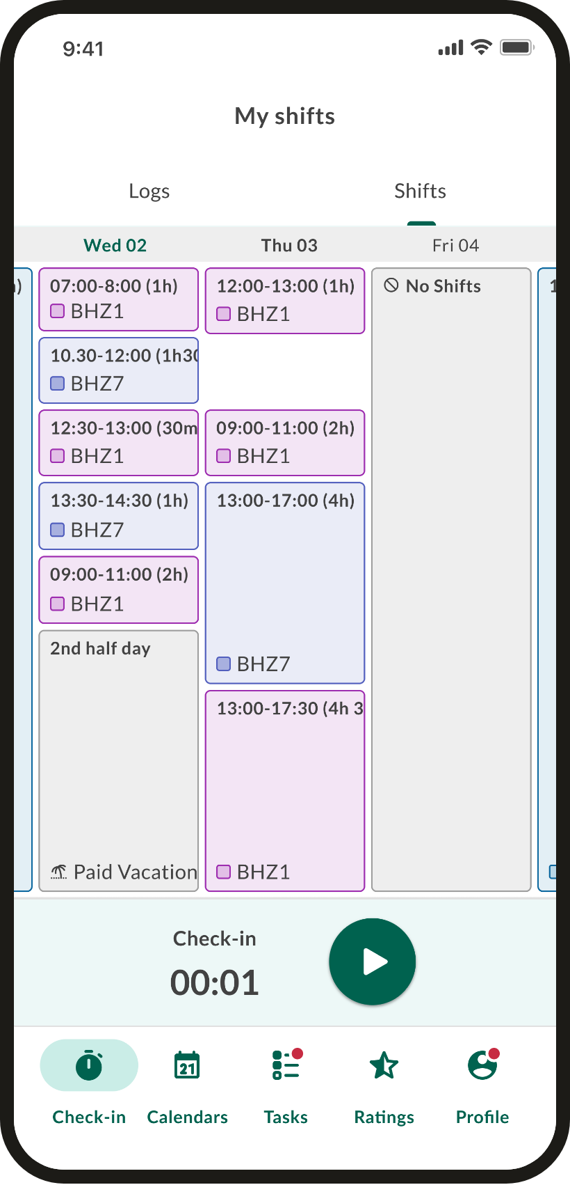
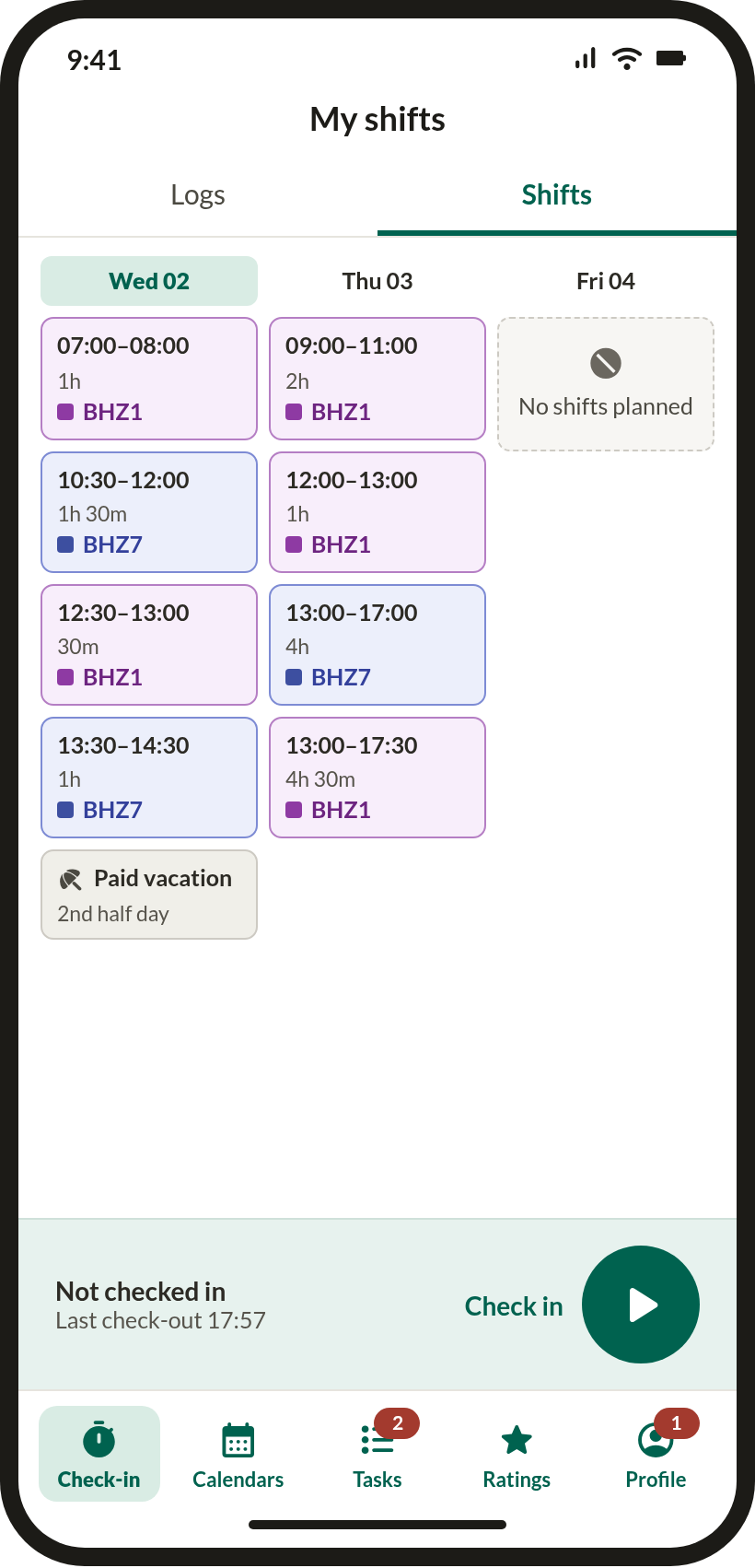
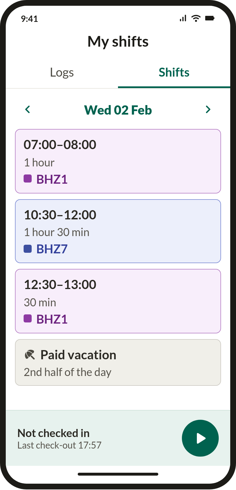
My shifts · week view
Auth flow
Forgot password — three taps, no friction.
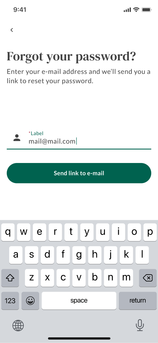
Email entered
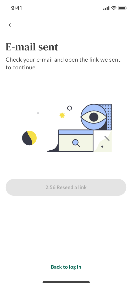
Confirmation sent · live
Accessibility · WCAG 2.2 AA
Accessibility is a step in the process, not a retrofit — every screen gets a WCAG 2.2 AA pass before it ships.
The pass runs across the app's core surfaces — calendar, check-in and check-out, day logs, shifts — as a structured screen review with contrast ratios measured pixel by pixel against the WCAG relative-luminance formula rather than judged by eye. Working with Claude makes that measurement fast enough to do on every screen instead of spot-checking a few. It catches what static review can catch: colour, labelling, text alternatives, target sizes, reflow. What it cannot reach — real VoiceOver and TalkBack behaviour, focus order, hit areas as built in code, Dynamic Type on device — is a separate pass on hardware, and naming that boundary is part of the method rather than a footnote to it.
9
Issues caught pre-launch
2
Critical
4
Major
3
Minor
3
Patterns already right
Measured
Every colour pair measured, not eyeballed.
| Element | Colours | Ratio | AA | Verdict |
|---|---|---|---|---|
| White text on dark-green chips and buttons | #FFFFFF#00624F | 7.3:1 | 4.5:1 | Pass |
| Blue text on pale blue — info banner, “Planned” chip | #00588F#E3EFF5 | 6.4:1 | 4.5:1 | Pass |
| Green “Checked-in” status on white | #007E3C#FFFFFF | 5.2:1 | 4.5:1 | Pass |
| Bottom-nav labels and icons | #00624F#FFFFFF | 7.3:1 | 4.5:1 | Pass |
| Shift cards — purple on pink, blue on lavender | #7B2D8E#F6E7F8 #3D4FA0#E8EAF8 |
6.3:1 8.3:1 |
4.5:1 | Pass |
| Orange “Checked-out” status | #B45309#FFFFFF #B45309#F5F5F5 |
4.6–4.9:1 4.3–4.5:1 |
4.5:1 | Borderline |
| Out-of-month and future dates | #9E9E9E#FFFFFF #D6D6D6#FFFFFF |
2.7:1 1.5:1 |
4.5:1 | Fail |
WCAG exempts genuinely disabled controls from contrast requirements — but these date cells are bordered and shaped exactly like the active ones, so they read as tappable. An exemption you have to explain to the user is not an exemption. Either the cell stops looking interactive, or it meets contrast.
Findings
Ranked by who they lock out, not by how hard they are to fix.
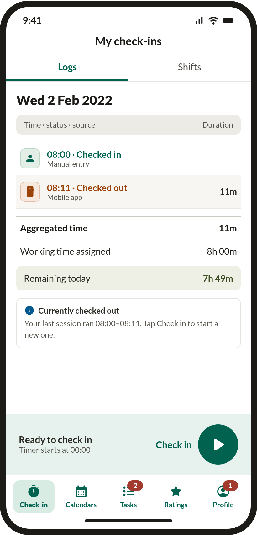
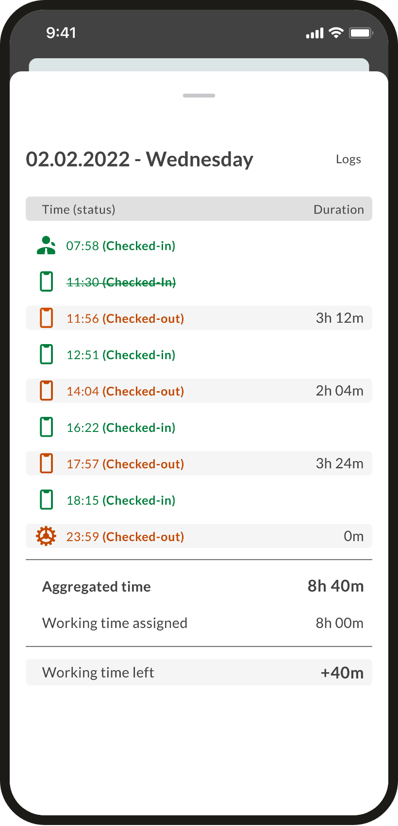
Log-source icons carry meaning with no text alternativePerson, phone and gear icons are the only thing distinguishing manual, mobile and automatic entries — invisible to a screen reader. The 23:59 gear marks an automatic check-out, which is payroll-relevant.
1.1.1 · 4.1.2Cancelled entries are conveyed by strikethrough aloneScreen readers do not announce strikethrough. A cancelled 11:30 check-in is read out as an ordinary one — the record sounds different from how it looks.
1.3.1Status orange is borderline on tinted rowsIt clears 4.5:1 on white but drops to roughly 4.3:1 on the grey alternating rows, where it is used most.
1.4.3Untracked dates fail contrast while looking interactiveAt 1.5:1 the numerals are barely visible, and the card border invites a tap that does nothing.
1.4.3 · 1.4.11Shift labels truncate at default text size“10.30-12:00 (1h30” and “13:00-17:30 (4h 3” are clipped before anyone changes a setting. At 200% Dynamic Type the card has nothing left to give.
1.4.4 · 1.4.10Notification dots carry state through colour aloneThe red dots on Tasks and Profile have no count and no accessible label — nothing announces that anything is waiting.
1.4.1 · 1.1.1Touch targets under 44 ptThe month chevrons and the bottom-sheet drag handle are sized to their glyphs rather than to a thumb.
2.5.8The live timer ticks every secondExposed as a live region it would interrupt VoiceOver once a second, which makes the rest of the screen unusable.
4.1.3 · 2.2.2Copy that contradicts itself“Working time left: −7h 59m” is a negative amount of something remaining. Vacation is marked with a bare 🏝 emoji, and the same day appears as both “10.30” and “10:30”, “Checked-In” and “Checked-in”.
3.1.5Confirmed
Three patterns the review confirmed were already right.
Before / after
Each screen reworked against the findings — first pass on the left, corrected design on the right.
Day logs — source, cancellation, plain totals

Calendar — inert dates, real badges, thumb-sized controls
Shifts — truncation, and what happens at 200%
Check-in — a quiet timer and honest copy