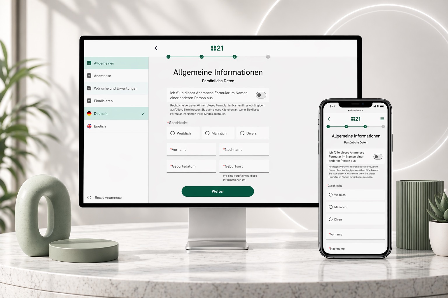
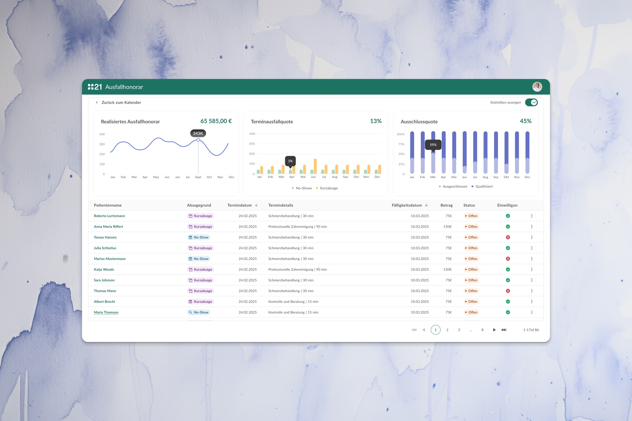
The brief
Rebuild the digital brand from zero, with the same rigour I'd bring to a product — desktop and mobile as one coherent surface.
SA Stavrakis is a Berlin clinic offering plastic surgery, non-surgical aesthetics, dermatology and cosmetics. The existing site had grown by accretion — treatment names buried three clicks deep, a hotel-brochure tone, and four very different audiences served by one over-generalised template.
The brief was deliberately open: UI patterns, an editorial photography direction, and a content architecture that treats surgical patients, injectables clients, skincare buyers and aspiring practitioners as a single coherent experience — and reads exactly the same on a desktop browser and a phone in the waiting room.
Type & colour
Two typefaces, six warm neutrals. The whole system in one breath.
Tinos for editorial weight — treatment-page headlines, brand promise. Inter for everything else — UI, body, labels. No accent colour anywhere. The palette stays in warm neutrals and lets the photography carry the heat.
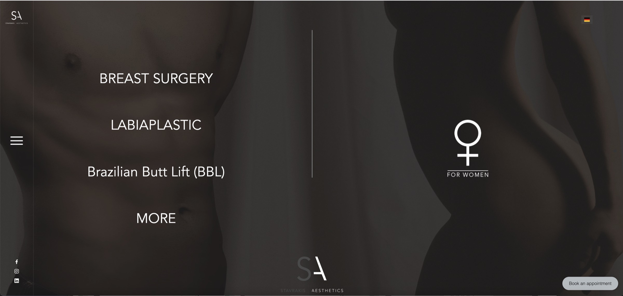
Before
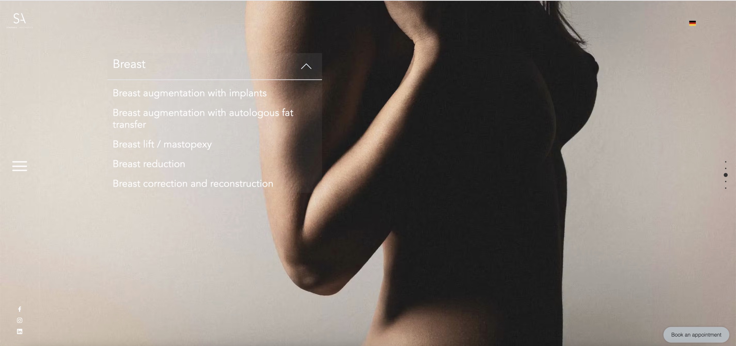
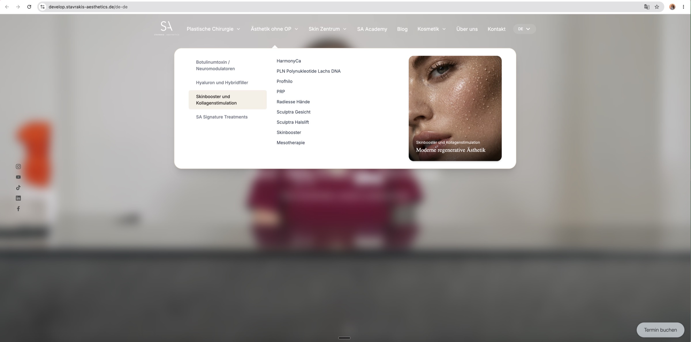
The old navigation made the treatments hard to find — and the brand harder to trust.
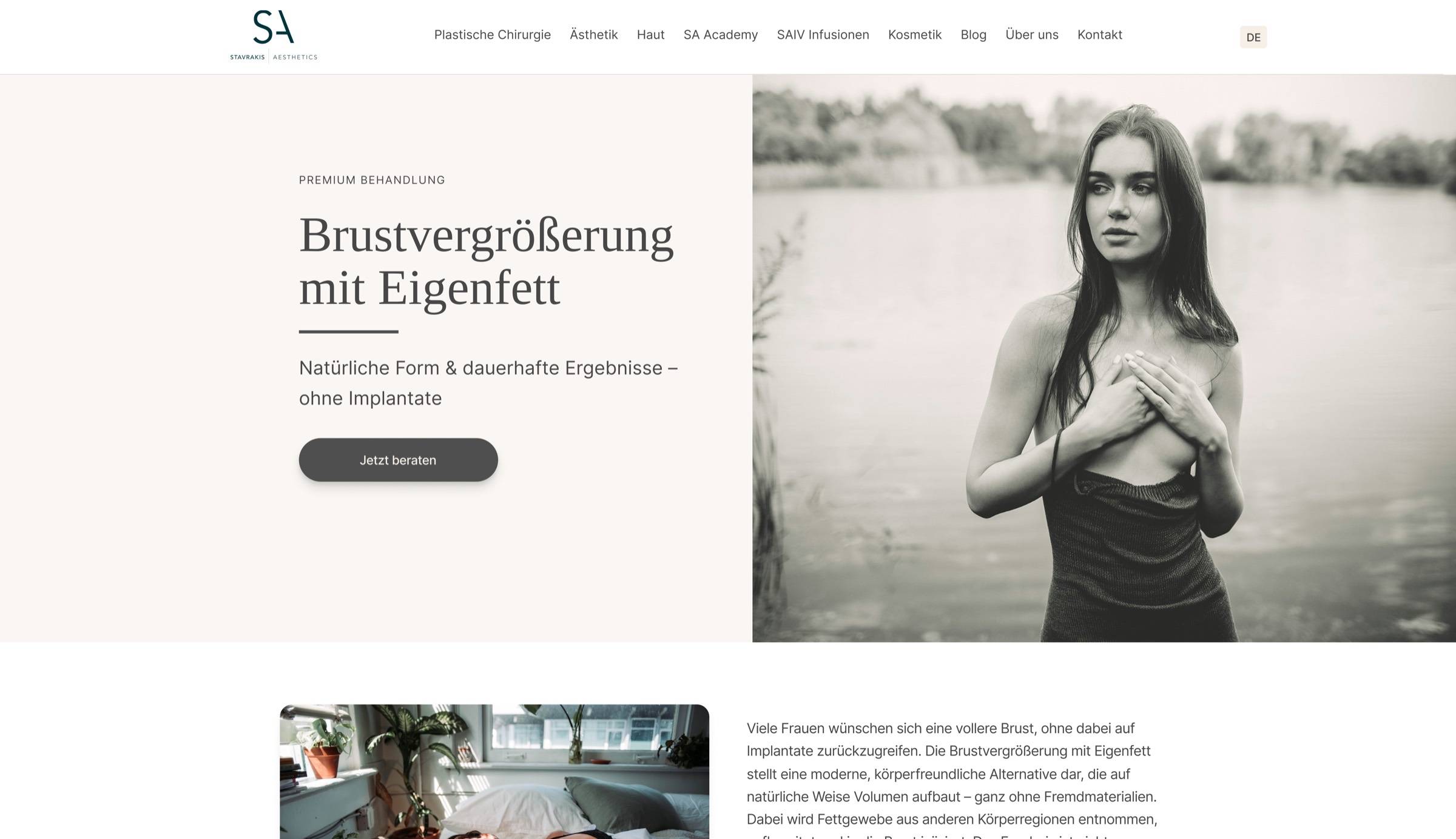
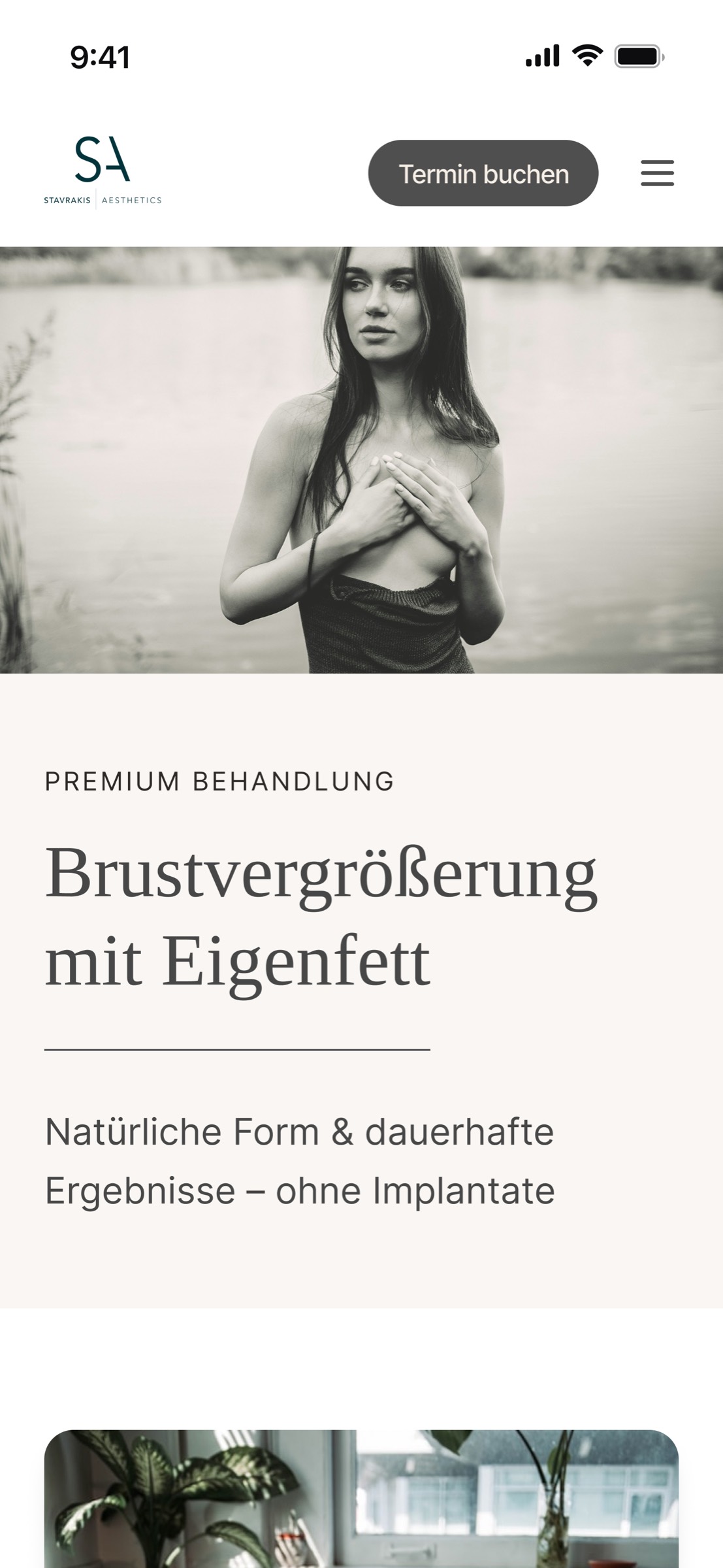
The previous site opened on a dark hero with two anonymous nudes split down the middle, a brand mark in the centre, and a tiny hamburger icon in the corner. The menu was hidden, gender-binary, and read more like a museum installation than a healthcare entry point: "For Women" / "For Men", then sub-categories revealed only after clicking. Treatment names were buried two clicks deep, in dim type over photographs of bodies.
It looked editorial, but it failed every measurable test of a clinic homepage: a patient could not see what was offered, what was relevant to them, or how to book without first decoding the brand's mood.
Photography · facial treatments
Macro skin, warm neutral light. Texture is the subject — pores, lashes, the gloss of a serum stroked across a cheek.
For the non-surgical face treatments — Botulinumtoxin, Signature Treatments, Hyaluron, Skinbooster — the photography stays close to the skin. Three-quarter portraits, soft daylight, no studio lighting drama, no smile-and-glow stock energy. The face is alive: a parted mouth, a freckle catching light, the wet sheen of product still settling.
These images do the work of trust-building. They show that the practice understands the result the patient is buying — visible skin, comfortable in itself — without performing it. The hand and the syringe appear unforced; the gloved hand is the only piece of clinical signalling in the frame.

Signature Treatments · serum on warm skin, daylight, no retouching of texture
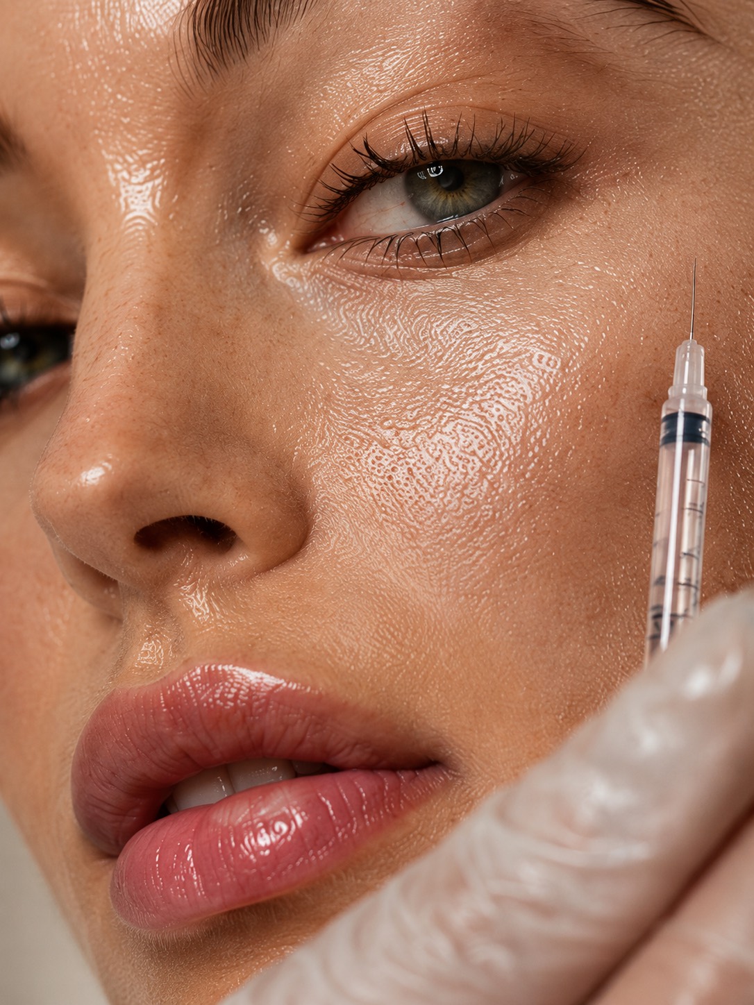
Botulinumtoxin · the syringe held unforced, gloved hand as the only clinical signal
Photography · body treatments
For the body, a different register entirely — cinematic, restrained, lit like sculpture rather than skincare.
Body treatments — Brustvergrößerung, Liposuktion, Bauchdeckenstraffung, Mommy Makeover — are emotional purchases. The photography acknowledges that. Where the facial work is warm and close, the body work is cool, shadowed, and edited toward dignity rather than allure: a side profile against a soft grey wall, the curve of a torso half in light, the body as form rather than feature.
A faint grain is added to soften the highlights and keep the digital sharpness from feeling clinical. The cool wall behind the bodies (the D1D5DC / 364153 family in the palette) is the only place in the whole site where a true cool tone appears — it stays here, in this register, on purpose.
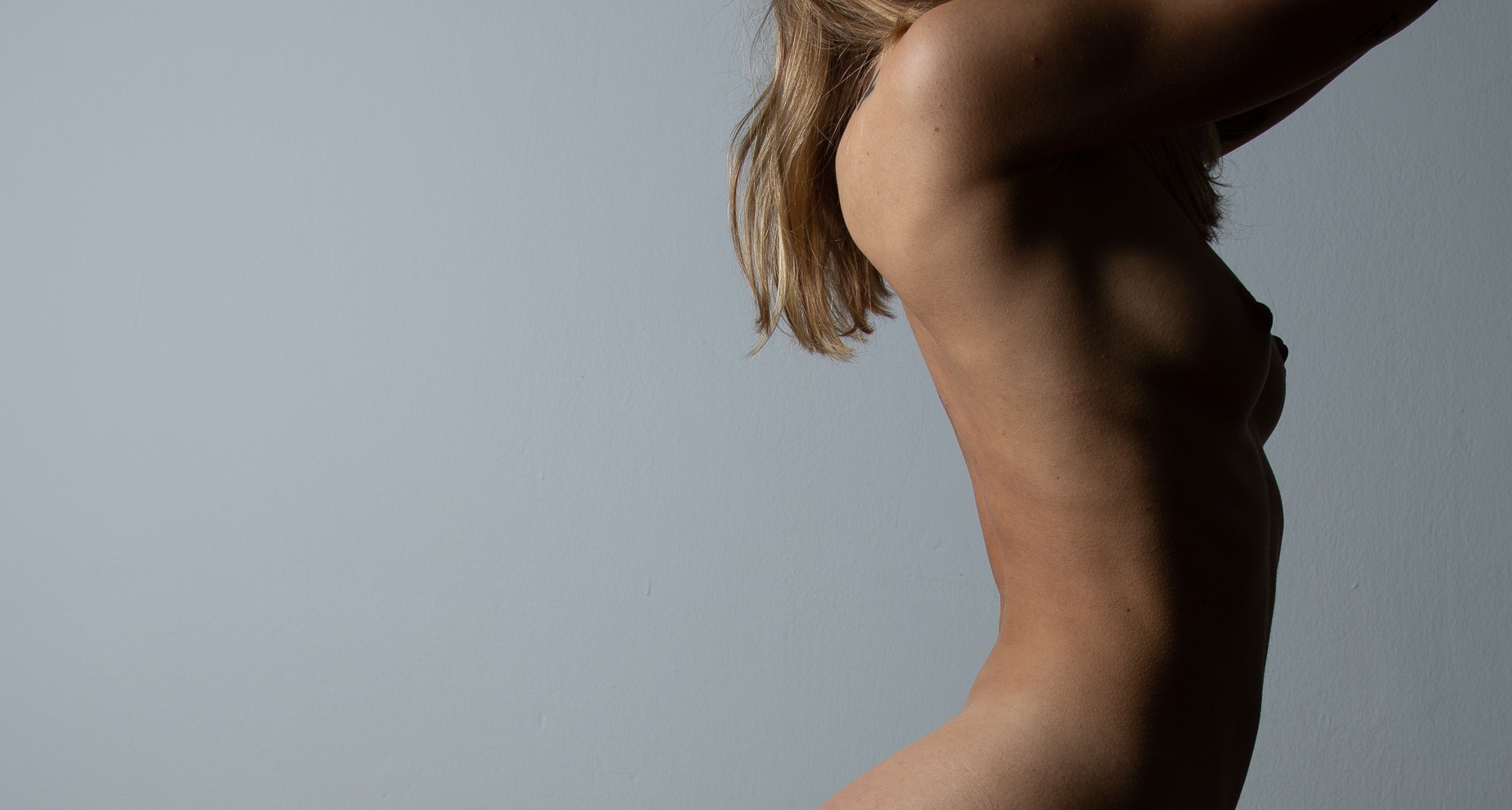
Body · side profile, cool grey wall, sculpted shadow on the rib line
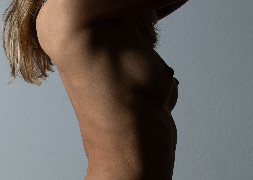
Brustchirurgie · contour and shadow, never a head-on display
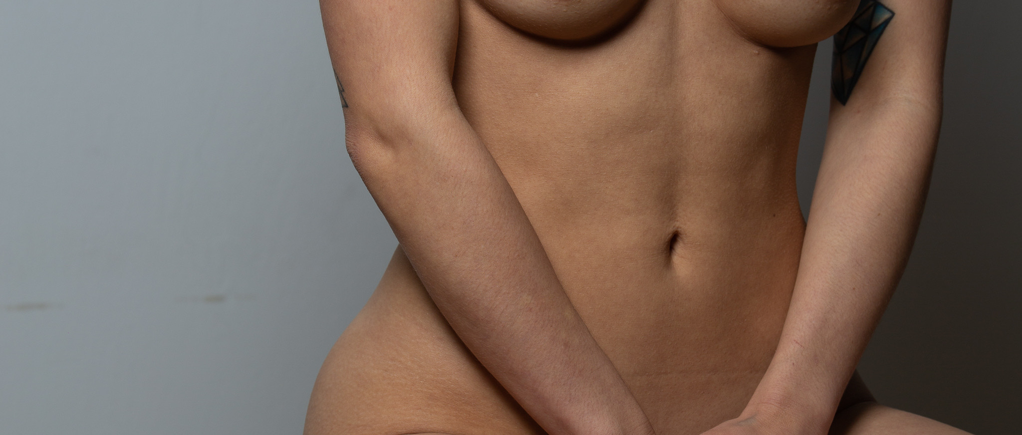
Intim · composition led by gesture, no clinical signalling on the surface
Trust · credentials
Faces, not logos. The doctor's expertise is the brand's most valuable asset — surfaced, not buried.
Aesthetic patients book a person, not a clinic. The site treats Dr. Stavrakis's credentials as primary content: years of practice, professional society memberships, language fluencies, and a personal note that reads in his own voice. Photography is portrait-led, not credential-card-led — the trust comes from looking him in the eye, not from a wall of crests.
Reviews and before-and-afters live further down the page, after the patient has already met the doctor. Order matters: meet, then evidence.

Consultation moment · the work of the practice made visible, not staged