Context
A booking flow that patients actually finish — and remember to attend
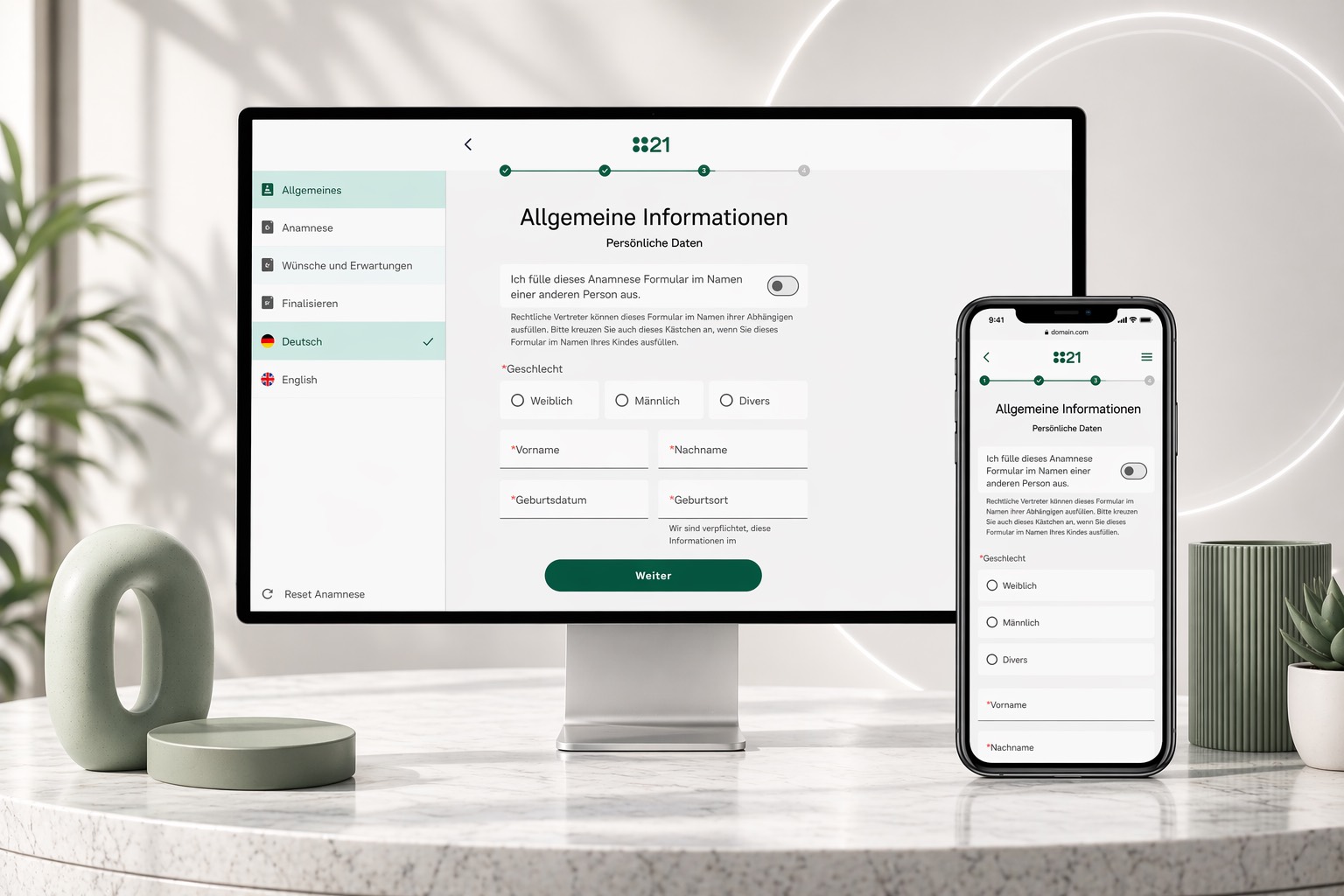
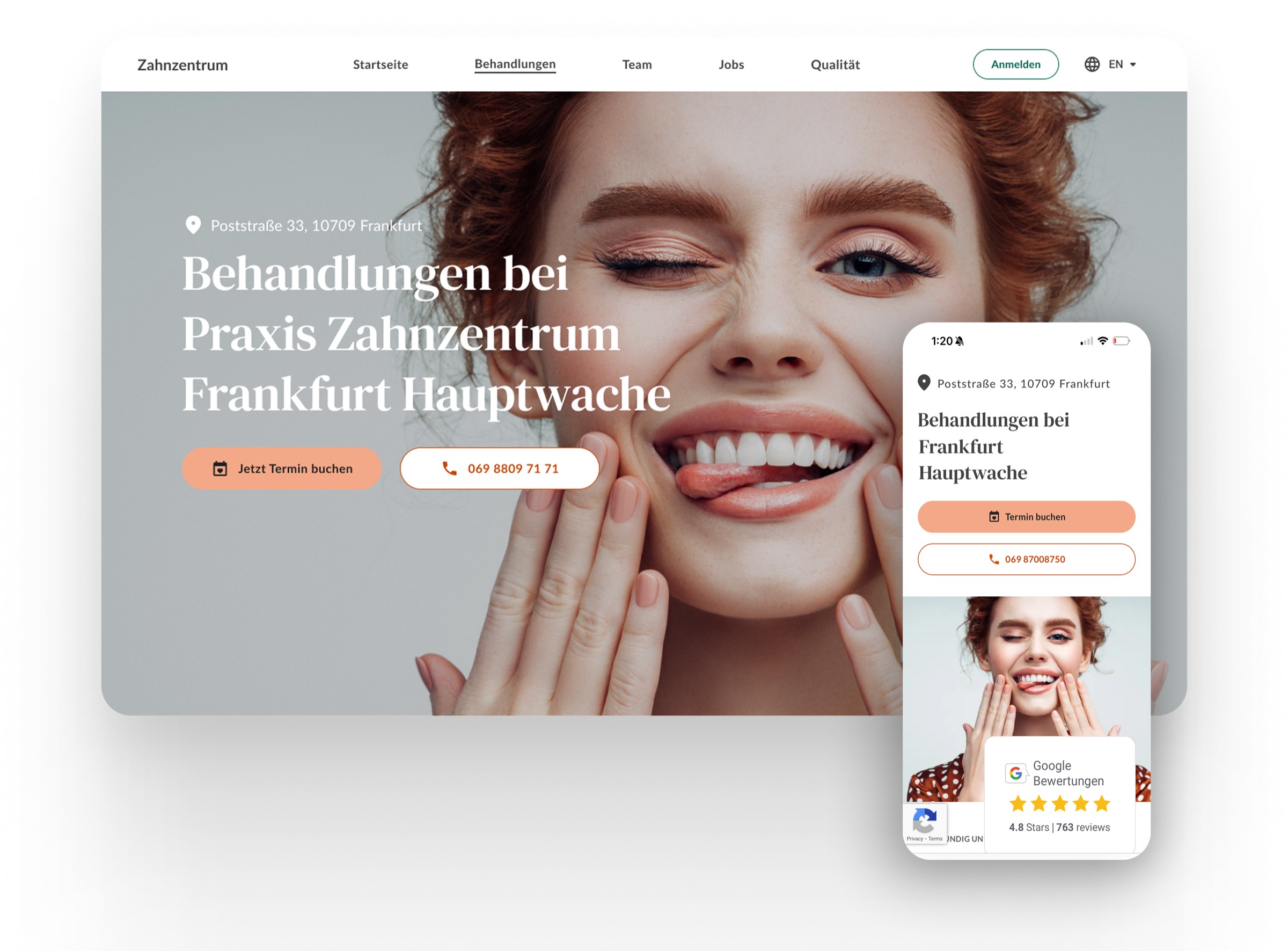
Patient21 runs a network of dental and general-practice clinics across Germany. The patient-facing booking surface had to answer three questions before anything else: which clinic, which treatment, which time. Get those wrong and the patient leaves; get them right and the rest of the funnel takes care of itself. The redesign treats the booking flow as one product across desktop and mobile — same logic, same language, two layouts.
Trust · practice gallery
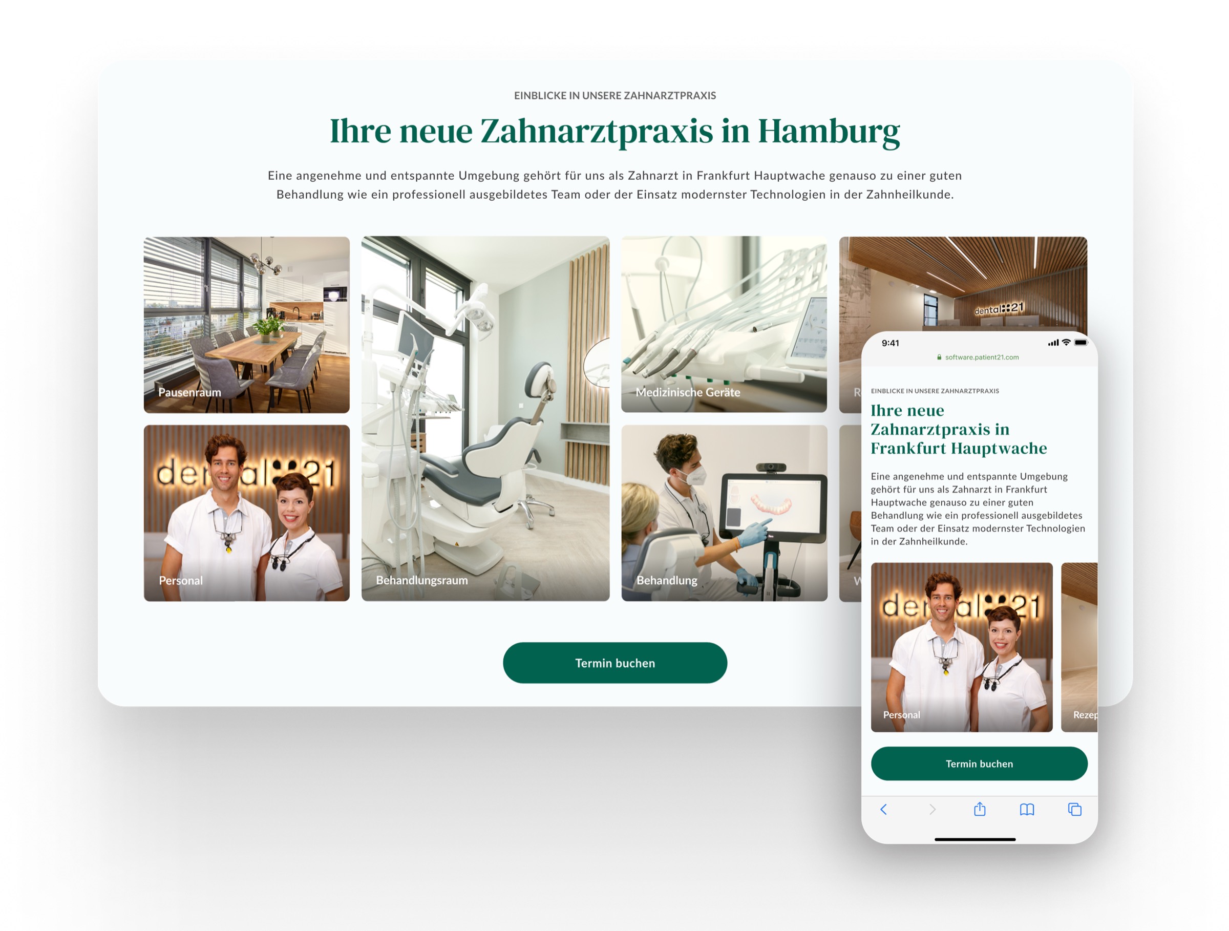
Show the room before the form. Trust is built before the funnel begins.
Patients hesitate when they can't picture where they're going. A short photo strip — reception, treatment rooms, the team — does more for completion than any reassurance copy.
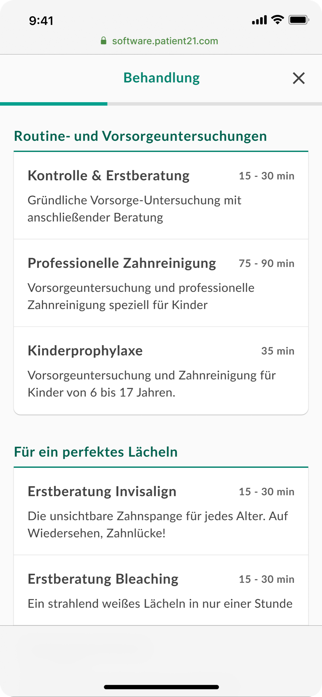
Step 01 · Behandlung
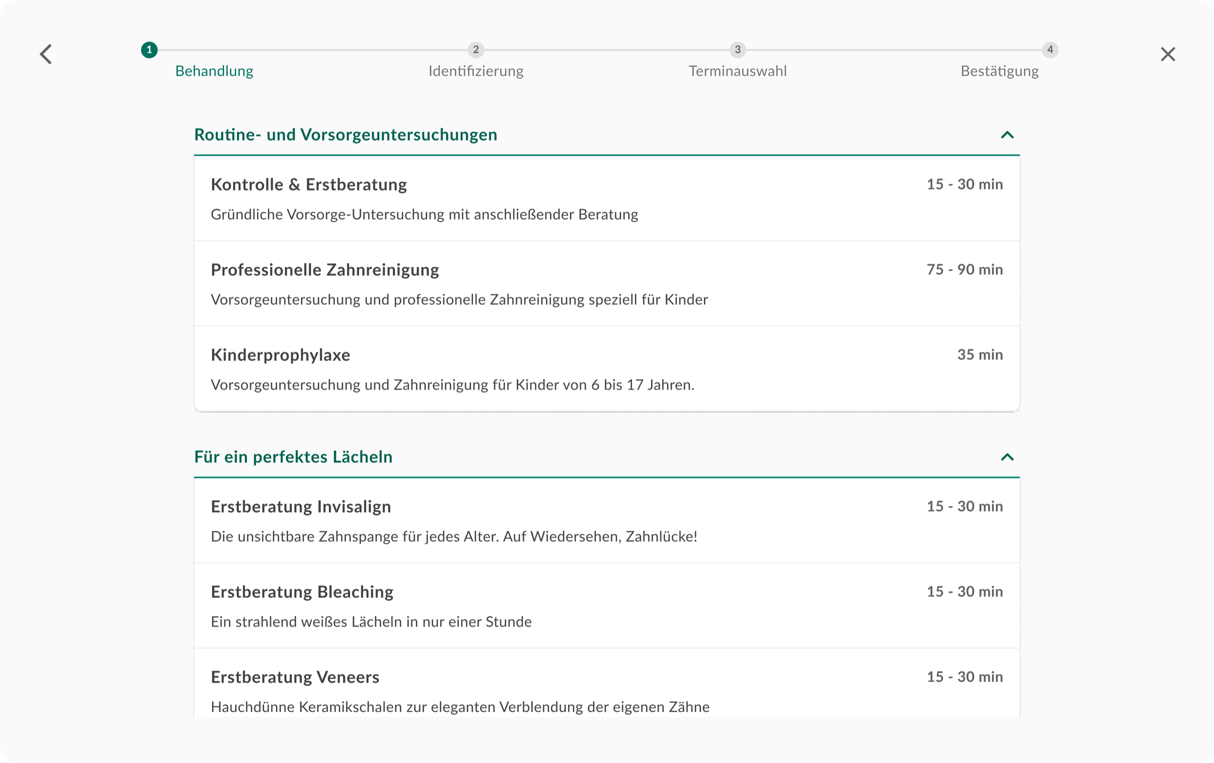
Treatments grouped the way patients describe them — not the way the system stores them.
Two collapsing groups (preventive care; cosmetic) carry the long tail of treatment types. Each row reads as a sentence with a duration, so the patient can scan in seconds — on a 15-inch screen or a phone in the U-Bahn.
Step 02 · Identifizierung
The smallest possible question, asked once. Slots surface immediately.
Two dropdowns — patient status and insurance — and we already show available times for tomorrow. The patient sees a real time before they enter a single character. That single change moved the conversion needle more than anything else in the funnel.
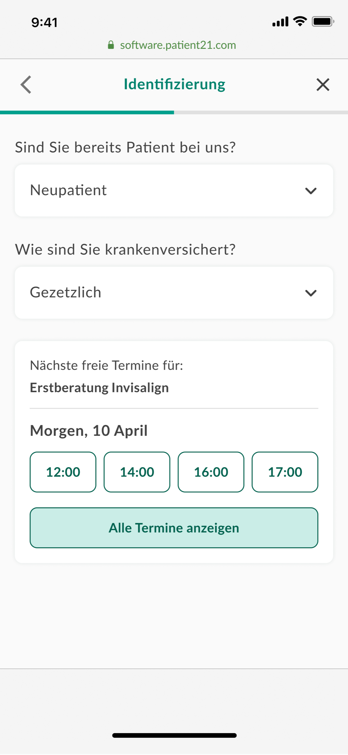
Account creation is pushed to the very end of the flow — never as a gate. Patients can browse, choose a slot, and only then commit to an account if they want one. The dark pattern of "register to see times" is gone.
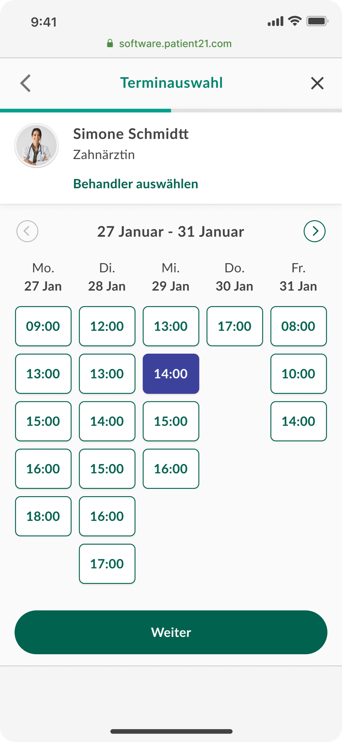
Step 03 · Terminauswahl
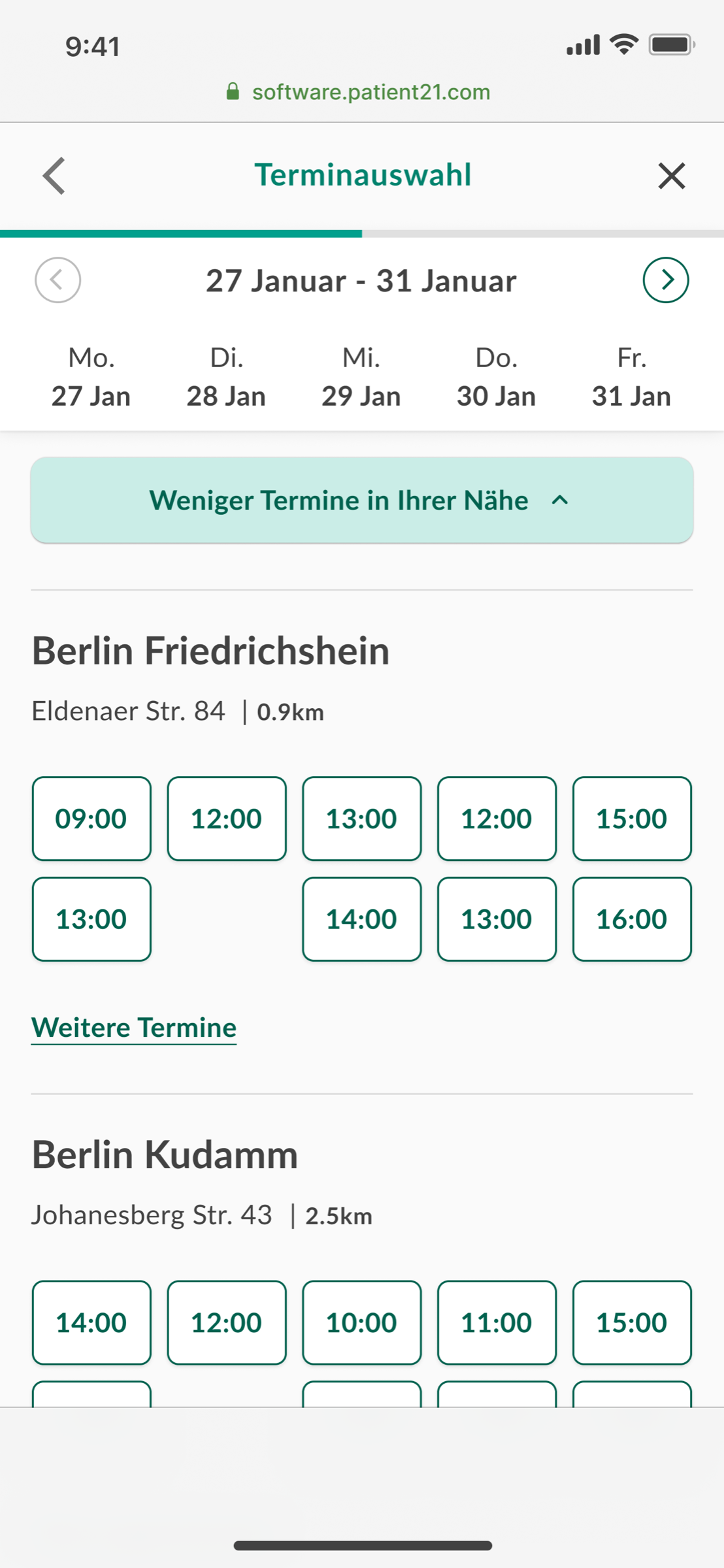
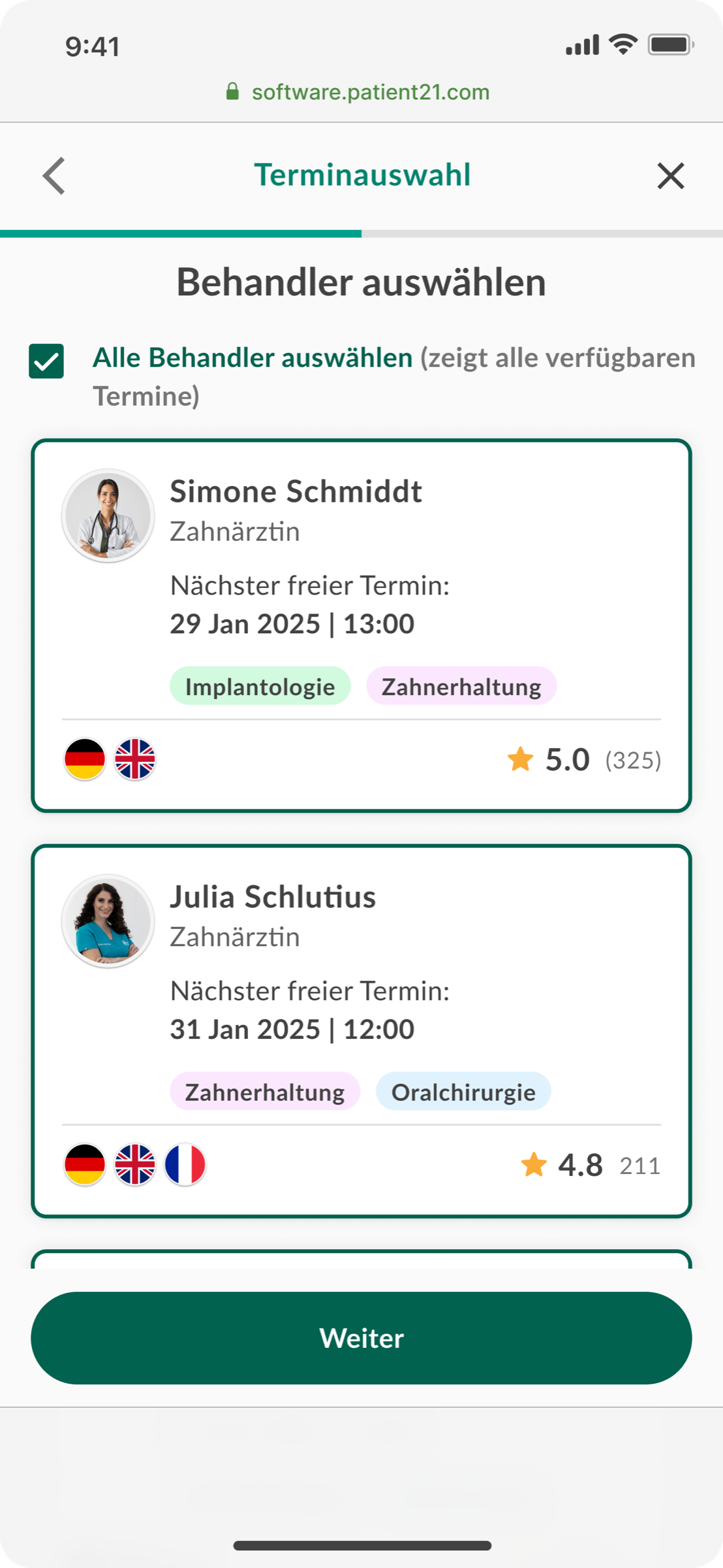
One screen, three views — a week, a city, a person.
The slot picker scales from a single practitioner's calendar to nearby clinics to a roster of available doctors with rating, languages and specialties. Same component, different lens — the patient picks the dimension that matters most to them.
Step 04 · Bestätigung
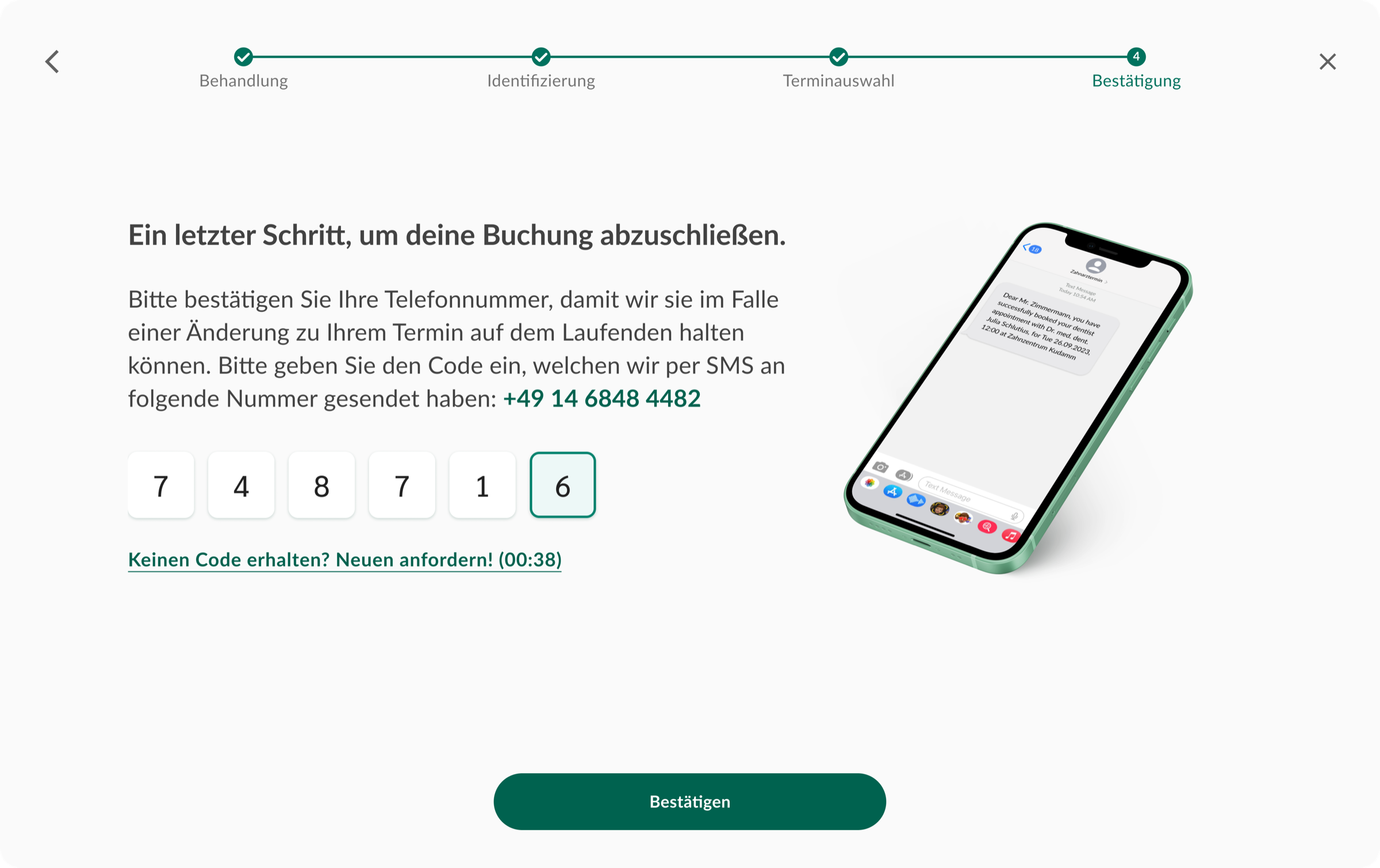
Confirm the human — not the password.
The final step uses a six-digit SMS code instead of an account. The patient enters their phone number, confirms it, and the booking is done. The right-hand visual mirrors what they'll feel in their pocket a moment later.
Confirmation
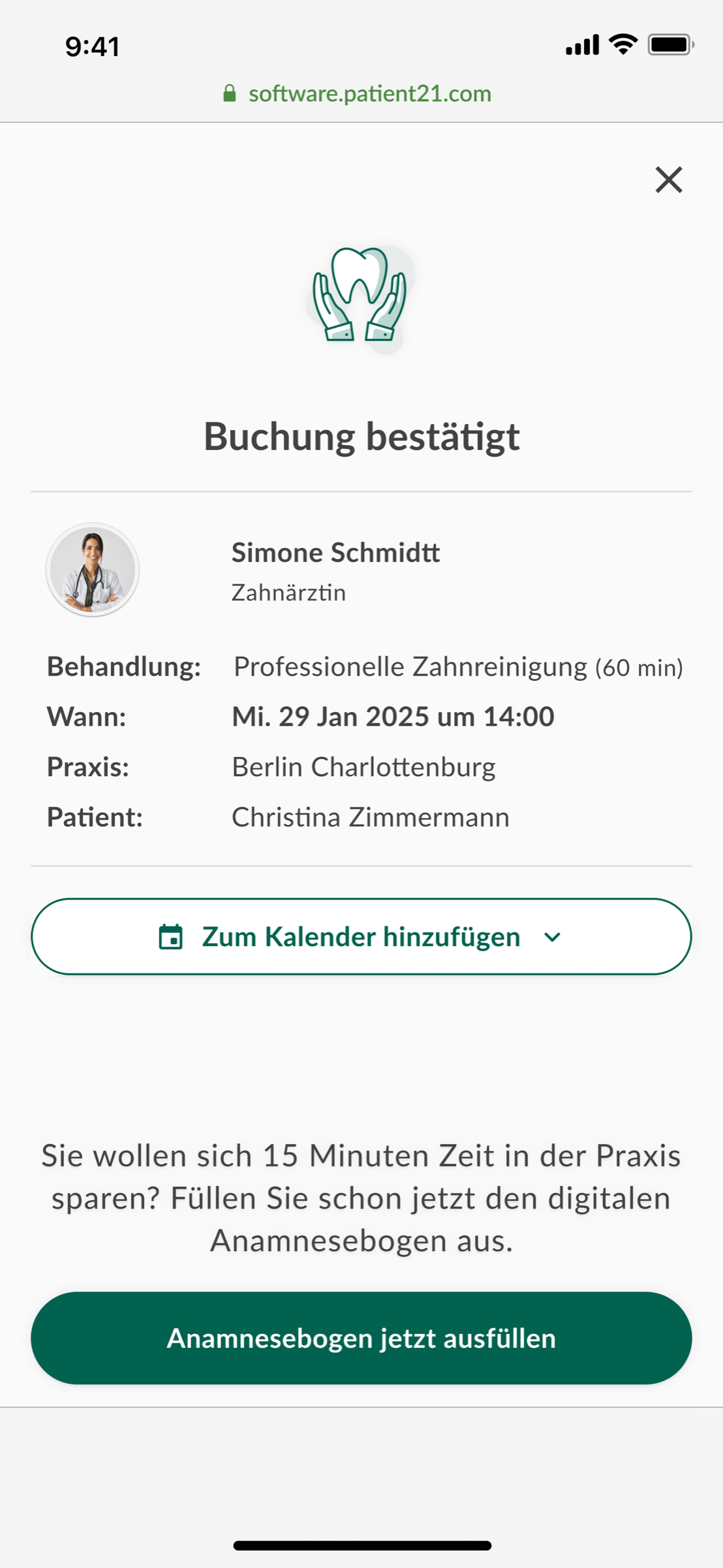
Confirmation as a hand-off, not an end-card.
The confirmation screen does three jobs at once: confirms the booking with everything the patient needs (treatment, doctor, address, time), offers a one-tap calendar add, and bridges into the digital anamnesis — saving 15 minutes in the waiting room. The flow doesn't end at "booked"; it sets up the visit.
Post-booking communication was redesigned end-to-end: immediate in-app confirmation, SMS + email with full clinic address and directions link, a 24-hour reminder with one-tap reschedule, and appointment-specific preparation instructions.
The 24-hour reminder with reschedule was the single highest-impact addition — patients who would have no-showed instead moved their appointment.
Outcomes
Funnel completion up. No-show rate down. Same product, calmer flow.
Drop-off at clinic selection fell sharply once contextual information — distance, available times, doctor names, languages — was shown alongside the choice. Removing forced account creation contributed the biggest mid-funnel lift; guest booking restored momentum exactly where it had been killed.
No-show rate declined meaningfully in the three months following the post-booking communication redesign. The 24-hour reminder with one-tap reschedule proved to be the single highest-impact addition — patients who would have simply not shown up were instead rescheduling.