48pages
Figma library
A single source of truth for color, type, components and surfaces — versioned 1.0 → 1.1.
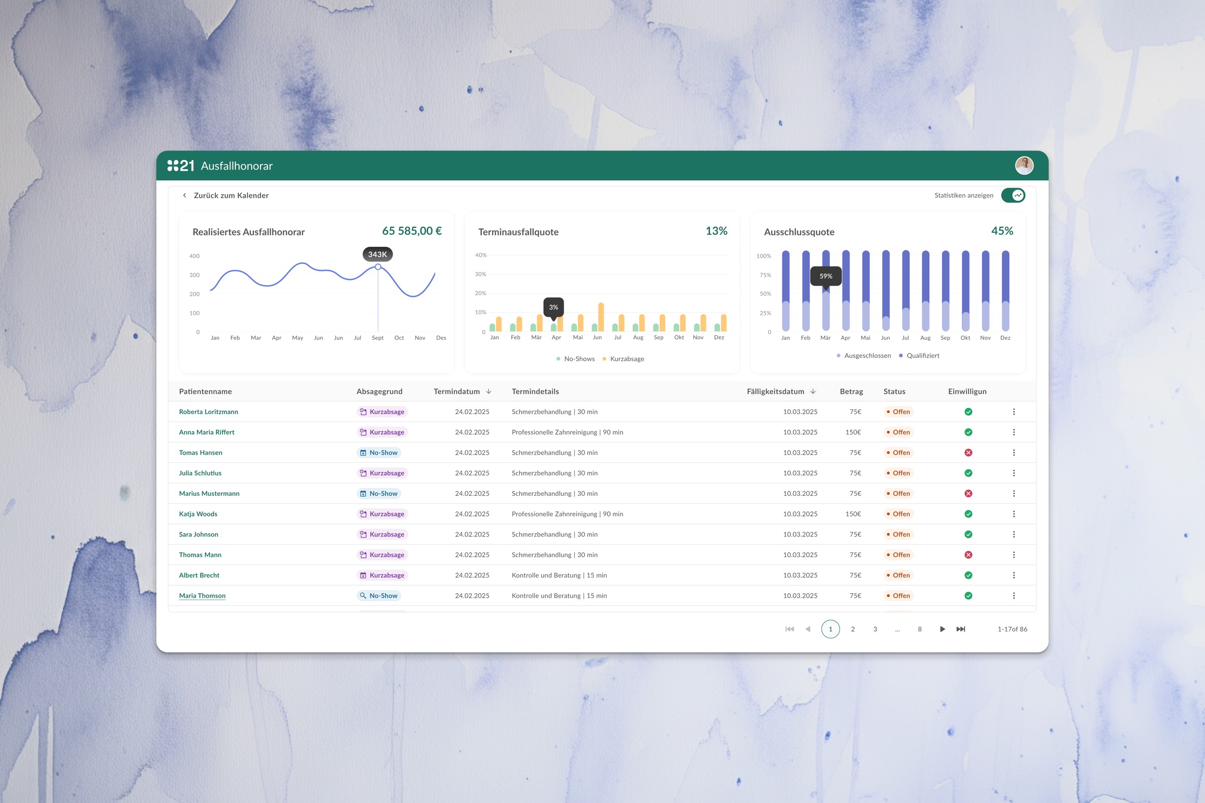
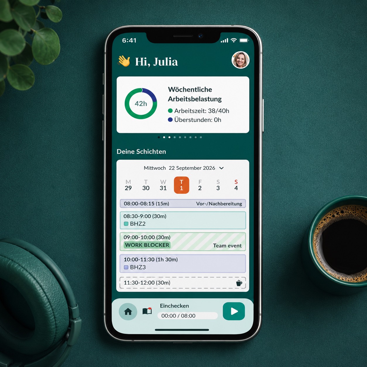
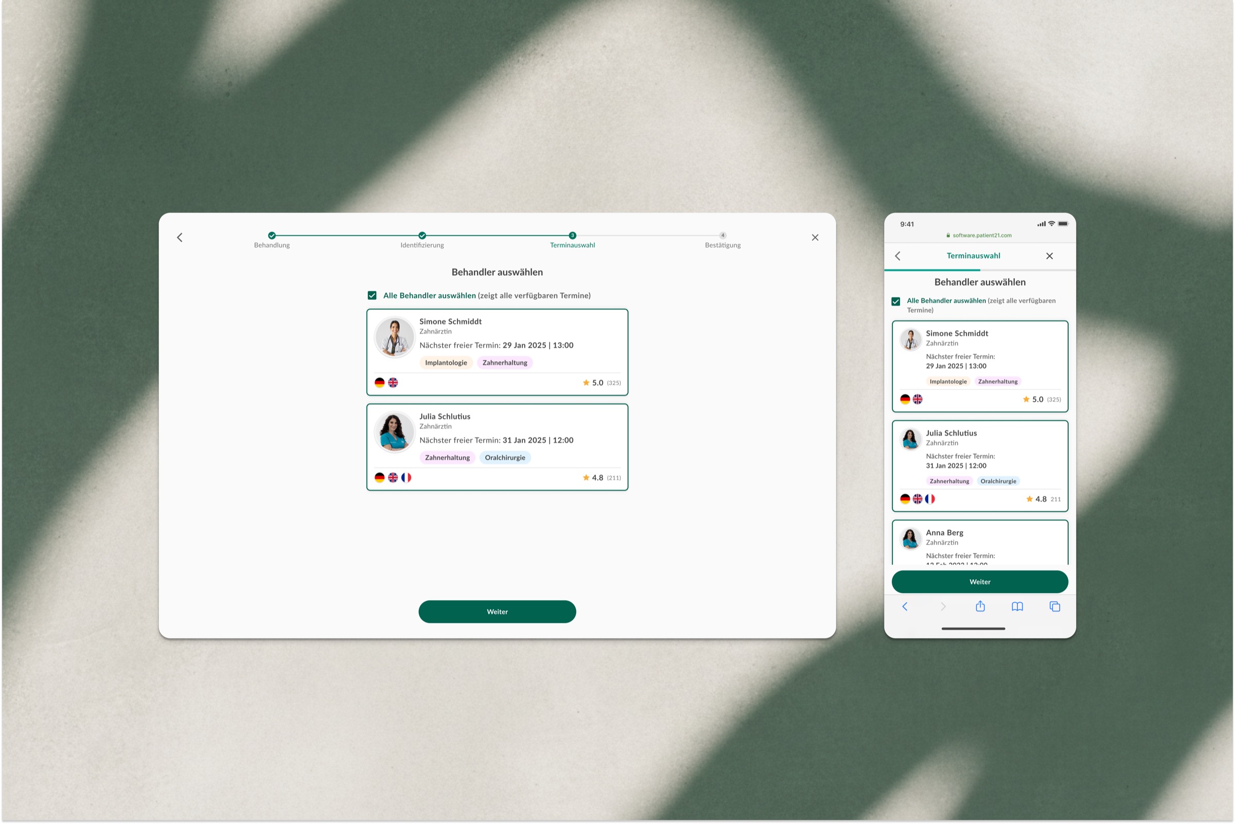
A design system and seventeen products, shipped under one quiet language — for our own clinics and the external practices that license the suite.
Dental21 had grown fast — first inside its own clinics, then through a long tail of external practices buying the software. Each one had a different idea of what the front desk should look like. Patients waited; receptionists improvised; the brand slipped a little every time. My job was to design a system calm enough to hold the whole network — internal and external — and quiet enough to disappear behind the work.
I sat at the front desk in Berlin-Mitte, Hamburg-Eppendorf, Frankfurt and four others. I watched calls, check-ins, room hand-offs. I learned what "Calmaster" actually meant.
I mapped every screen, every button, every shade of green being used. The audit found 38 distinct greens. We kept three.
Colour, type, spacing and elevation were settled and handed to engineering before a single component was final. Components followed. Screens came last.
Lint rules in Figma. Component contracts in code. A weekly office hour. The system gets stronger every Friday at 16:00.
Every surface in P21 is built from the same four primitives — color, type, spacing, elevation — plus one signature shape: the fully-pill button. The rest is restraint.
One primary (aqua), one secondary (orange, used sparingly), three semantic (success, warning, error), three extended (analogous blue, triadic blue, triadic purple) and a full grey.
Buttons are always Bold 14/20 with 0.25px tracking. Body is Regular 15/24 with 0.25px. The display weight is Light — the brand whispers, it doesn't shout.
4, 8, 12, 16, 24, 32, 48, 72, 80. Every padding in P21 is one of these.
The fully-pill button is the most recognisable element of the brand — it appears on every product surface, identical, every time.
Layers 1-5 use grey-tinted shadows for resting cards and modals. 6-10 are for menus and overlays.
Filled variants are reserved for selected and active states. We never use emoji or unicode glyphs — every mark is a real SVG, every time.
Cards lift on hover from shadow-2 to shadow-4 with no translation. Lists add and remove with 150ms fade and 8px slide. The brand has a calm pulse — animations follow it.
The same foundations, the same components, the same writing voice — across every screen a patient, dentist or front-desk colleague ever sees, in our own clinics and in the external practices that license the suite.
Voice is a design decision. We wrote and rewrote every string in the system — twice in German, once in English — and pinned the rules to a one-page content guide every PM, designer and engineer reads on day one.
Add patient · Save · Start shift · See design guideline
Add A New Patient · Click to Save · Start the Shift Now!
Claire will remind you before 18:00.
I'll send a reminder at 5pm 😊
3 rooms · 21 patients today · 2 callbacks outstanding
Three rooms · seventeen products today
Saved.
Saved successfully!
Eight clinics, 40+ shadowing hours, 38 greens identified. Output: a 60-page audit and the case for a single system, signed off by founders.
Colour, type, spacing, elevation. Defined and handed to engineering before any component was final. The earliest of them are still in production untouched.
Buttons, inputs, cards, status pills, avatars. Every component documented with hover, pressed, focus, disabled. Pseudocode JSX for every spec.
One clinic, one shift, one receptionist. We watched her use it. We rewrote eleven strings the same evening.
Phased over six weeks. One rollback (a calls panel that didn't translate well to the Hamburg workflow). Re-released ten days later.
Availy, Happy, my21 and the marketing site adopted the system. Friday office hours started. Lint rules went live in Figma. External practices started licensing the suite this quarter.