The problem
Clinicians were working around the software, not with it
Patient21 operates a network of general practice clinics across Germany and several EU markets. The internal practice management software handles everything: scheduling, patient records, billing, lab orders, prescriptions, and clinical documentation.
The software had been built iteratively over years, with each team adding features without a cohesive design layer. By the time I joined, clinicians were using workarounds — sticky notes on monitors, duplicate entries, manual cross-checks between screens — to compensate for what the software failed to surface clearly.
The daily task load for a GP using the system: 20–30 patient encounters, each with documentation requirements, referral management, and billing codes. Every friction point in the software compounded across the entire workday.
I have four windows open at the same time just to see what I need for one patient. It shouldn't be this hard.
GP, Patient21 Berlin clinic · user interview
Approach
Clinic observation before redesign
Before touching Figma, I spent time in clinics. Watching how doctors and front-desk staff actually used the system. Not demos, not interviews — observation during live appointments. The patterns that emerged were different from what was reported in support tickets.
The core issue wasn't missing features. It was information architecture. The software organized data around its own data model — not around the workflow of a consultation. Doctors needed patient context, current problem, history, and documentation tools simultaneously. The system gave them these in four separate modules.
I mapped the information needs of a typical consultation flow — pre-appointment, in-appointment, post-appointment — and used this as the foundation for the redesign. Everything in the interface was then organized around this flow, not around the backend data structure.
Solution
One view per consultation, not one view per module
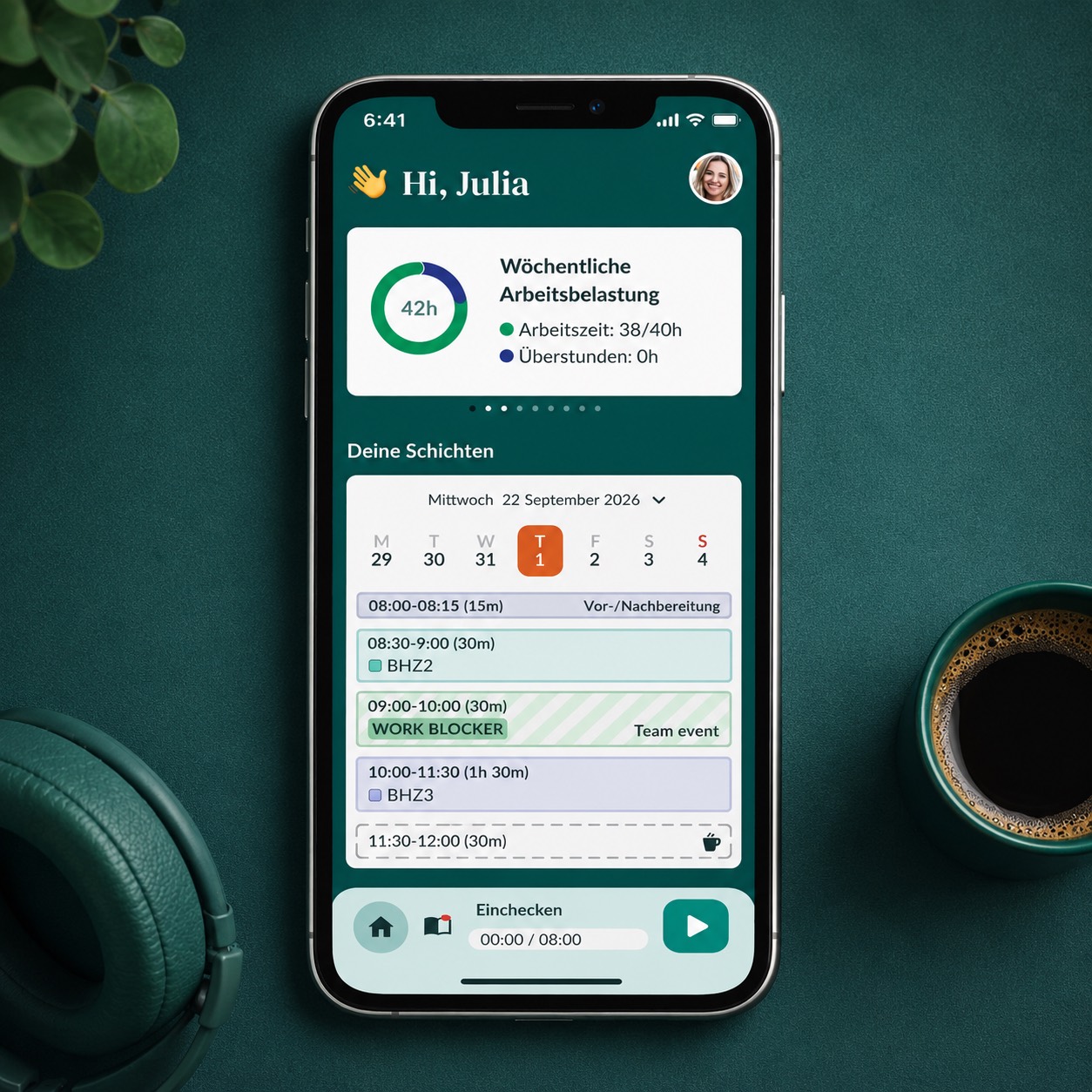
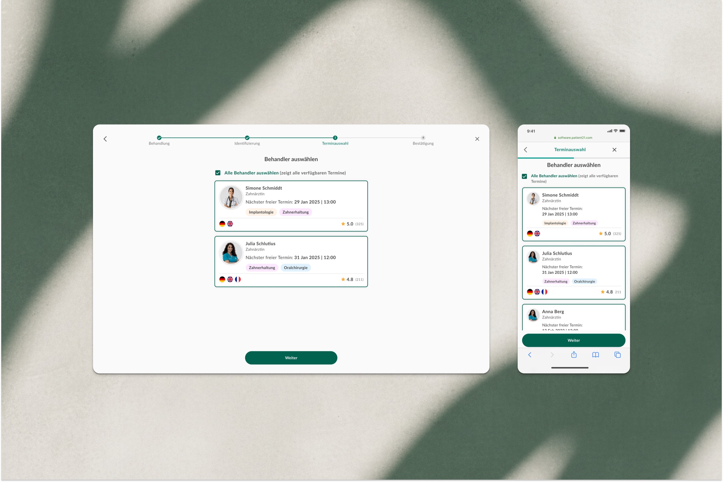
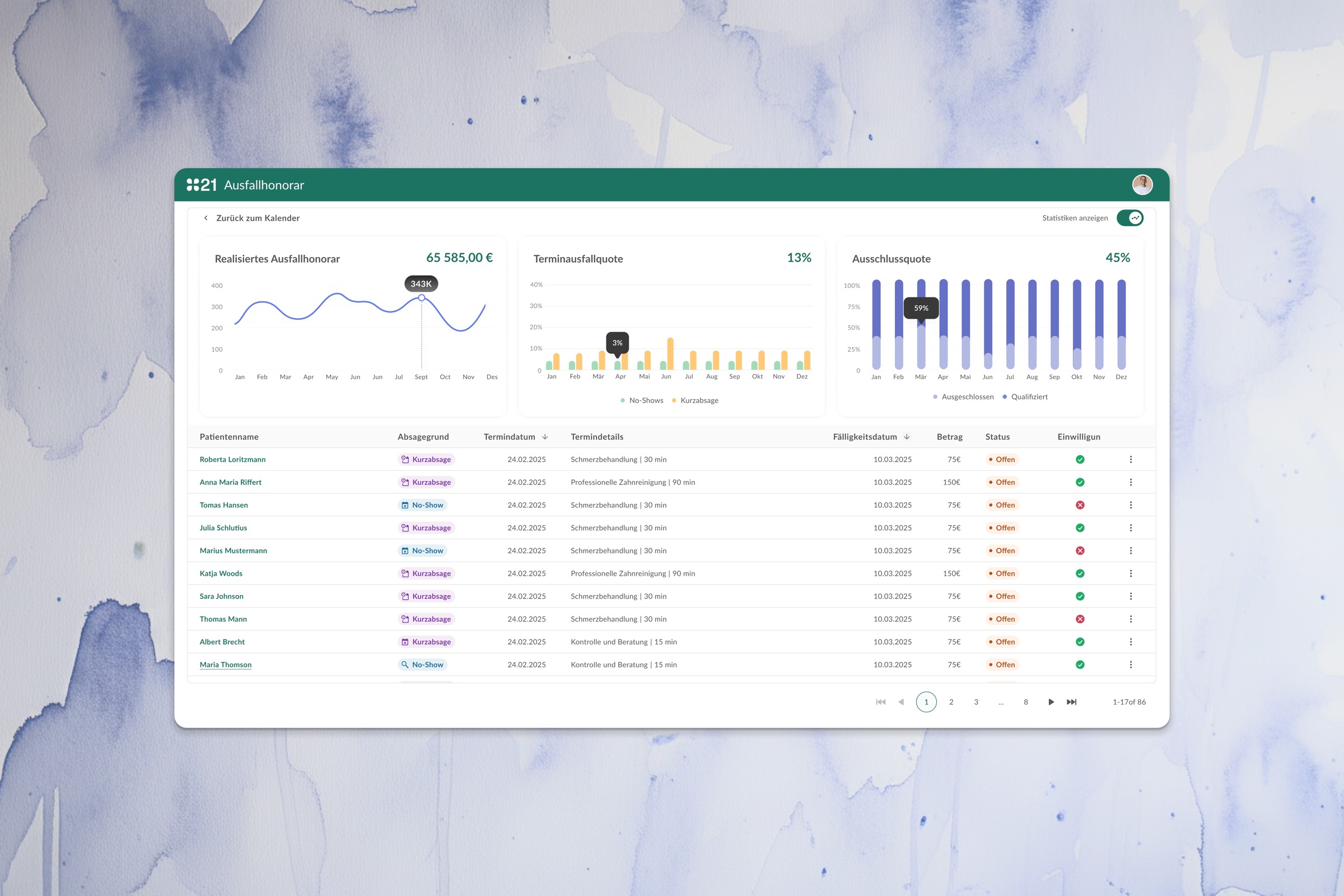
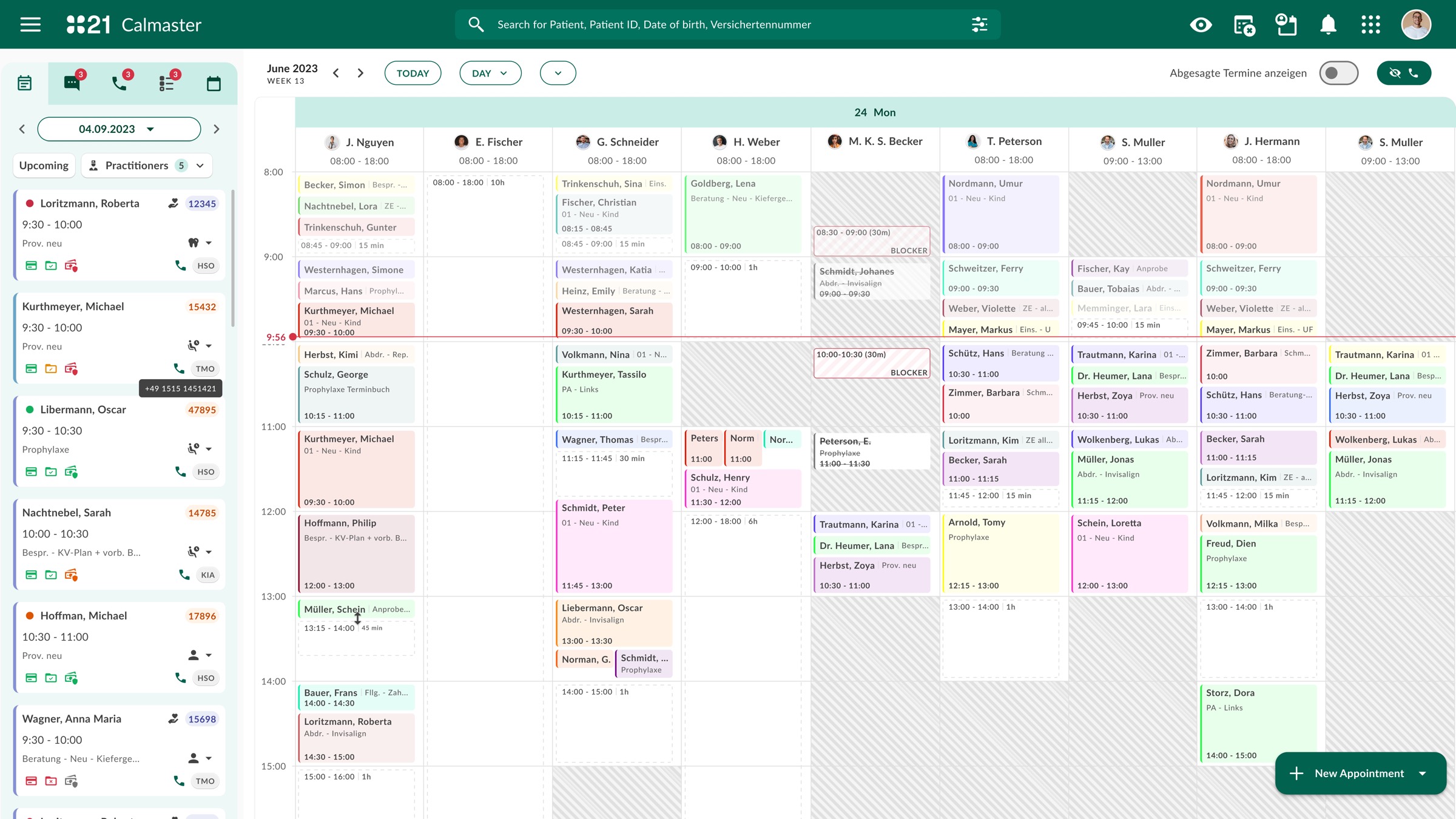
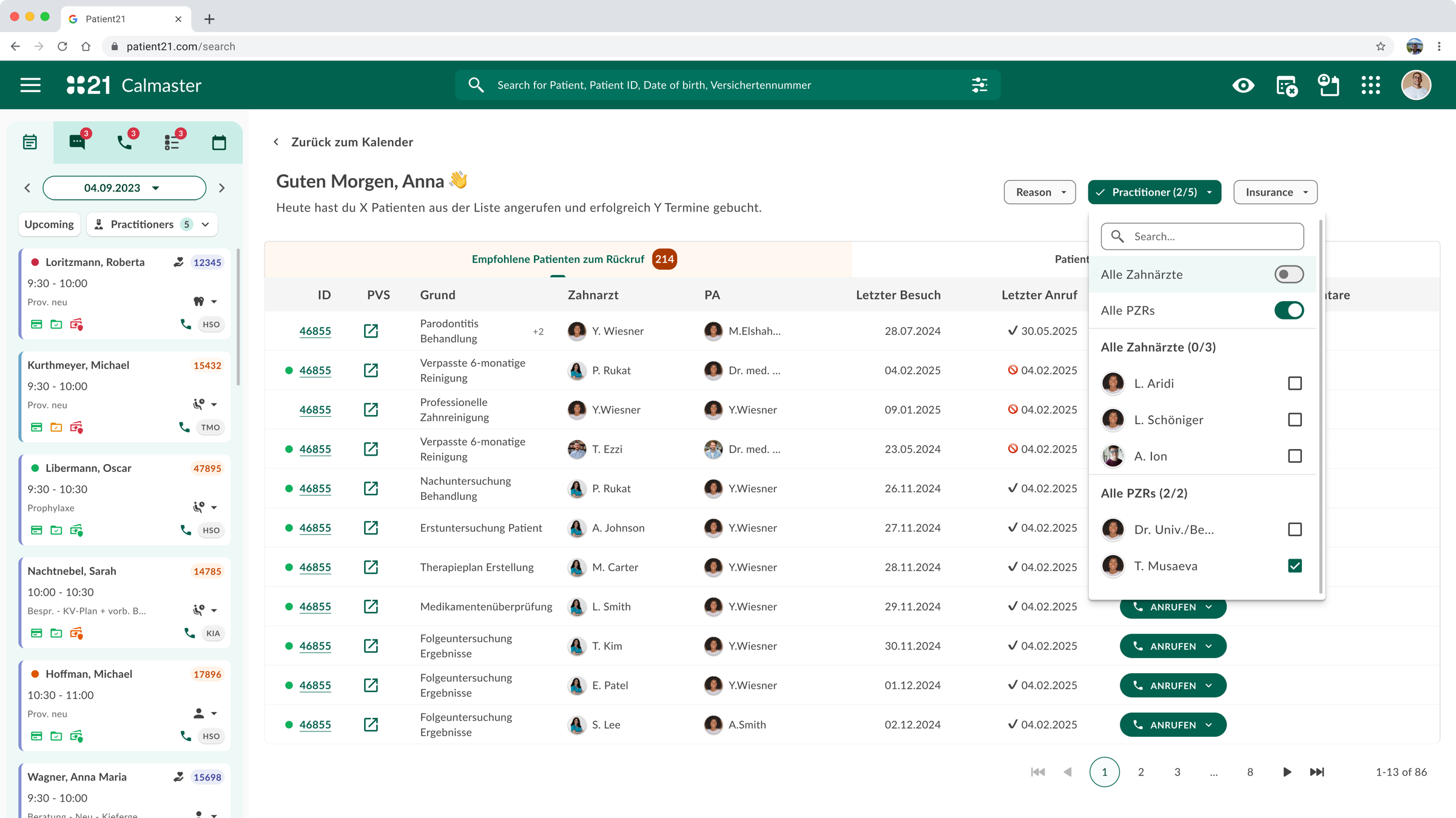
The redesign introduced a unified patient consultation view — a single screen that surfaces the right information at the right time, organized around the three phases of a clinical encounter.
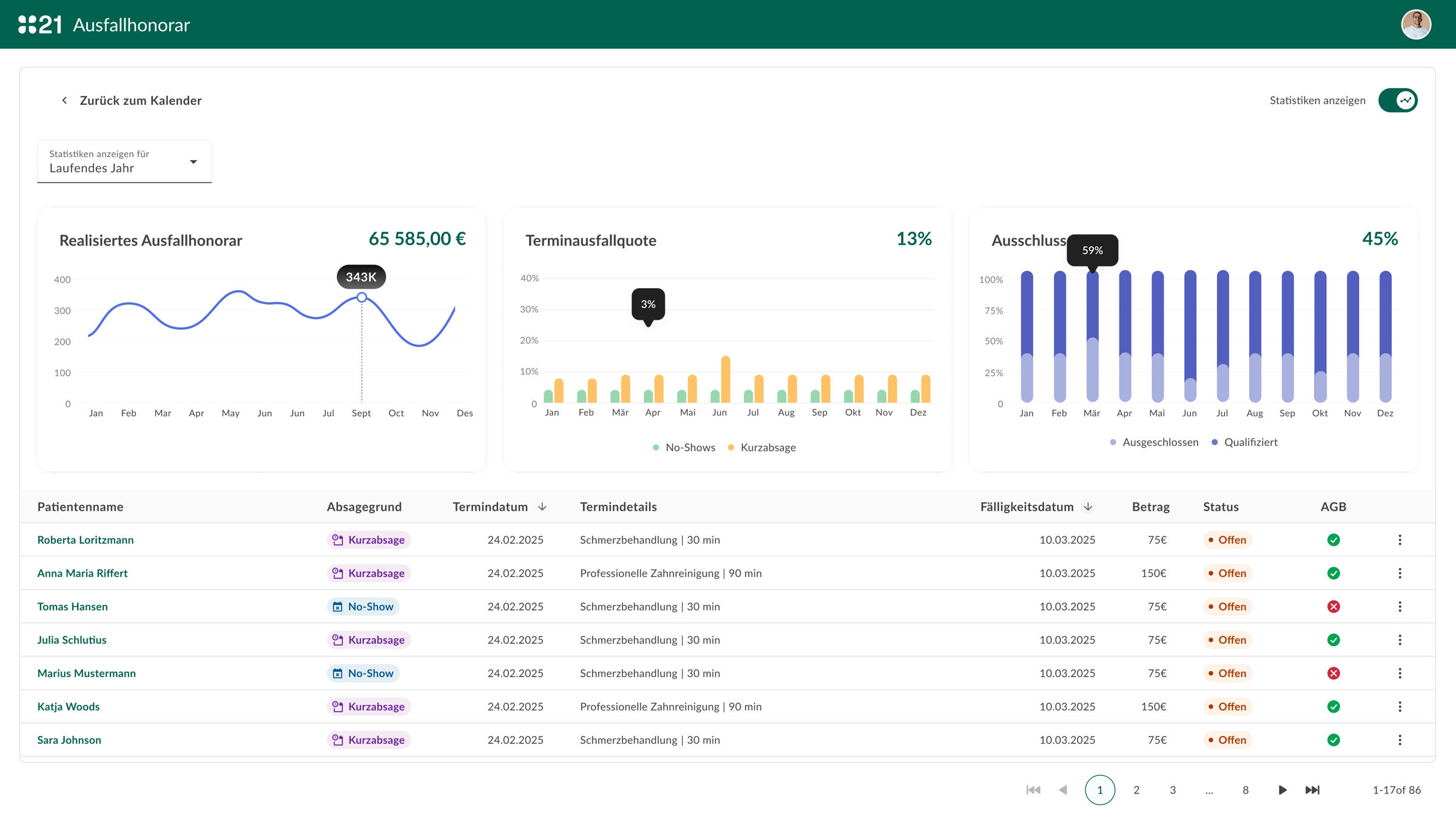
Documentation templates were rebuilt as structured forms with smart defaults based on appointment type, reducing free-text documentation time by an estimated 40% in early testing. Billing codes were suggested based on documented findings, eliminating most of the manual coding step.
The navigation structure was flattened from seven levels to three, with a persistent quick-access bar for the most common cross-patient actions: new appointment, lab results, prescription queue.
Key design decisions
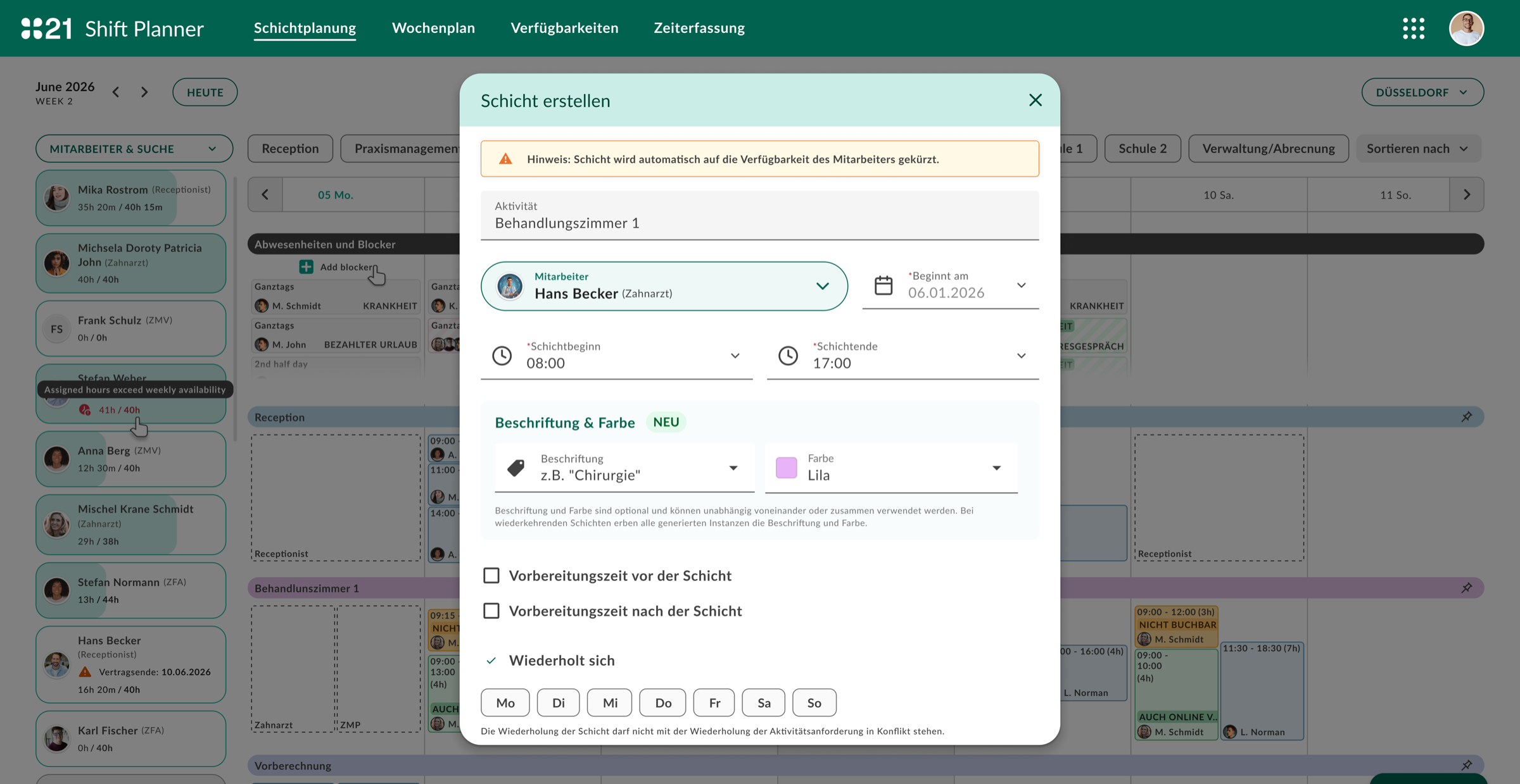
- Context-aware sidebar: shows patient history, allergies, and active conditions without requiring a separate screen
- Structured documentation templates by appointment type — reduces cognitive load and documentation time
- Billing code suggestion engine — codes proposed based on documented findings
- One-click referral drafting from within the consultation view
Outcomes
- Documentation time per patient reduced (measured via FullStory session analysis)
- Reduction in support tickets related to "finding" patient information
- Clinician satisfaction score improved in post-launch survey
- Onboarding time for new GPs shortened — new interface is learnable without extended training
What I learned
Healthcare software fails when it optimizes for the system instead of the person using it
The most significant insight from this project was the gap between how software is architected and how it needs to behave in practice. Data models, compliance requirements, and integration constraints shape what gets built — but they rarely shape what gets experienced. Bridging that gap is the design problem.
The other thing this project reinforced: observation beats interviews for workflow software. What people say they need and what they actually do in a 10-minute appointment slot can be completely different.