AI Documentation

Medlog, an AI tool for dental practices, turns treatment documentation into billing. I redesigned it so the AI suggests and the people decide.

Dentists and assistants document every treatment, and the AI turns that documentation into billing positions for the patient's insurance. The first version was barely used. I interviewed the people who document every day, mapped the market, and redesigned the product under a strict brief: frontend only, no new features. Most of the gains came from taking things away.

01 Where it started

The product worked. Customers didn't like using it.

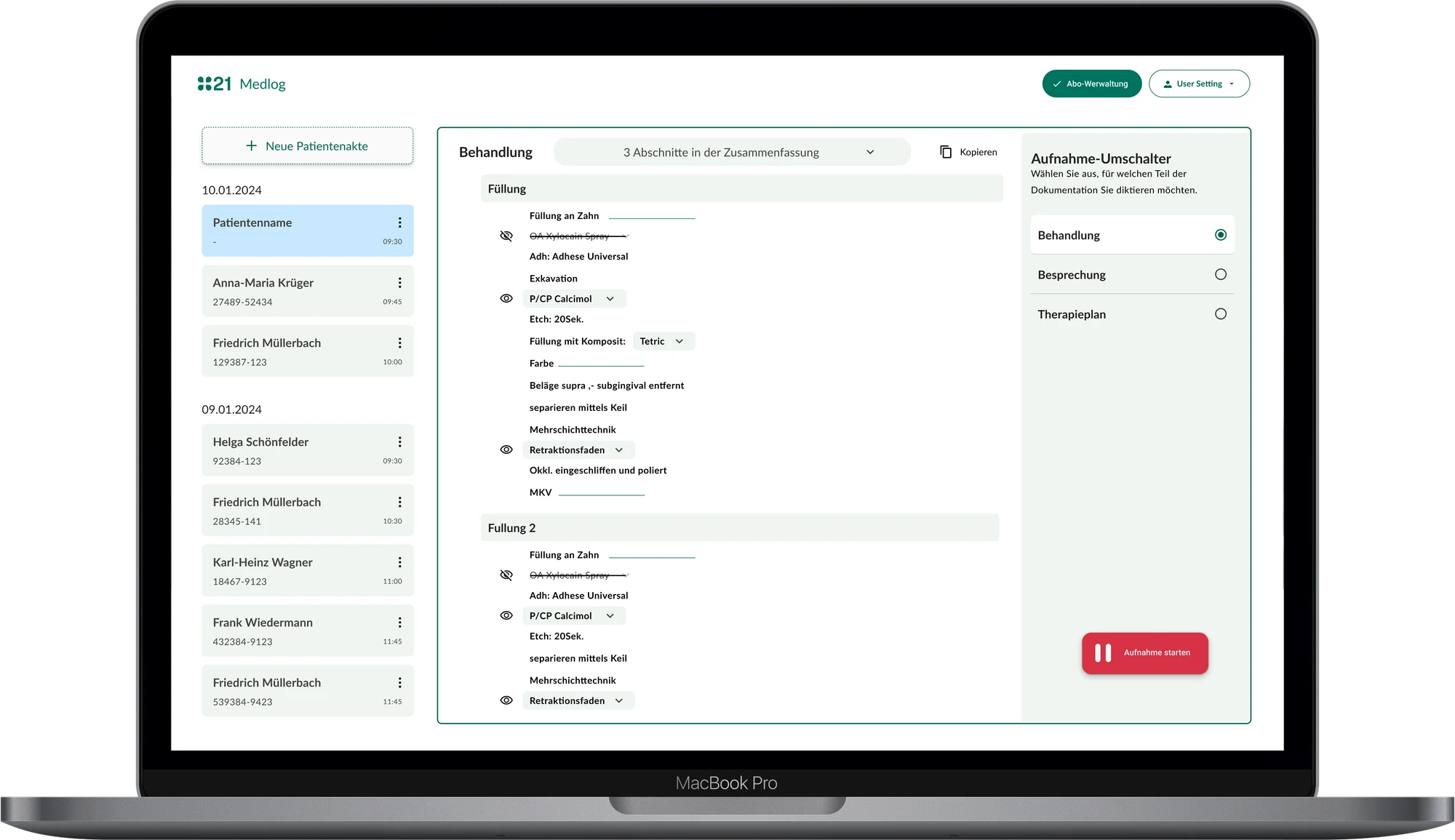
Before · Medlog 1.0
Medlog 1.0 filling documentation on a laptop: a long list of text lines, with a recording-mode switcher taking the right third of the screen
Designed by someone else. Documenting a filling: one long, dense list, and a third of the screen spent on choosing a recording mode.
After · End result
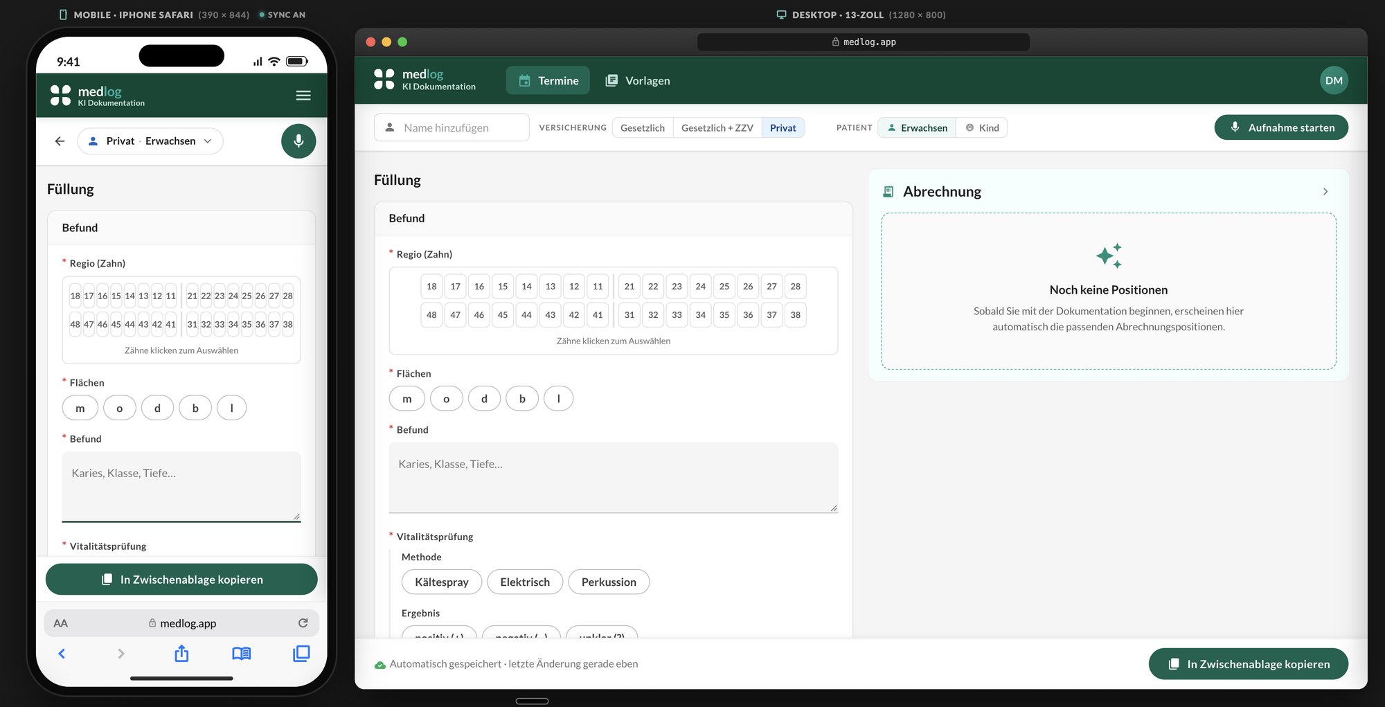
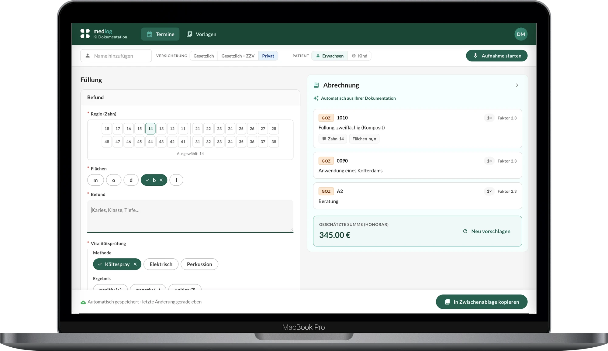
Redesigned filling documentation on the same laptop: grouped fields with tooth and surface selection on the left, the suggested bill on the right
The same filling. Clear, grouped fields, recording as one button in the header, the suggested bill beside the documentation, and one action to copy it into the record. Launching soon, including the tooth chart I proposed.
A polluted recordEvery empty field wrote "[keine Eingabe]" ("no entry") into the permanent patient record.
A switcher nobody neededA whole column for three recording modes, two of them barely used.
Templates that didn't fitToo much text, too many options, unclear structure.
Mouse-onlyEvery step needed a click, while the practitioner's hands were busy.
02 Research · February 2026

Nobody complained about the look.

I interviewed three dentists and two assistants, people who document treatments every day. Five was deliberate: in a first round, five users surface most usability problems, and we wanted to move fast and test again later.

I also reviewed eight AI documentation tools in Germany, the UK and the US, four with a full feature audit. Every one was voice-first or tablet-only. None gave structured reasons for raised billing factors. That told us where to compete instead of copying.

5interviews: 3 dentists, 2 assistants
8competitor tools reviewed
6questions, from "what makes you angry?" to "what should I fix next week?"
0competitors giving structured reasons for raised billing factors
Structure, not style

The pain was in templates, the record output and losing work. So we redesigned structure and flow first.

Hidden features

People didn't know they could stack several templates in one session. A real capability, invisible.

Recording in the room

Voice recording felt strange to patients. It had to feel calm and in the practitioner's control.

03 The brief

A frontend facelift. New functionality.

Product set a strict brief: work with the existing backend and add nothing new. Every improvement had to come from structure, flow and removal. For every element we asked: does this earn its place? Ideas that needed backend work went to a later version, and I kept them in the design so the path stayed visible.

04 Design decisions · with two PMs, weekly reviews

The AI proposes. People stay in charge.

01

Nothing is billed without a yes

The AI drafts billing positions from the documentation. The practitioner accepts or rejects each one; nothing reaches the bill on its own. In the first release the bill appeared on a click, because the backend couldn't update it live. The end result updates as you document.

02

Suggestions are shown, not edited

Catalogue, code, description, teeth, quantity and factor, read-only. Final edits happen in the practice management system, where billing staff already work.

Trade-off Less flexibility here, one source of truth there.

03

One calm recording mode

Two recording modes became one, because the audio pipeline was the same. No live transcript, because scrolling text is noise during a treatment. Instead: a reactive waveform, a timer, Pause and Finish.

Trade-off Less visible "AI magic", more calm in the room.

04

Voice or keyboard, no hunting for fields

Every field is open at once, no accordions. Practitioners dictate, or type and move to the next field without reaching for the mouse.

05

A clean record

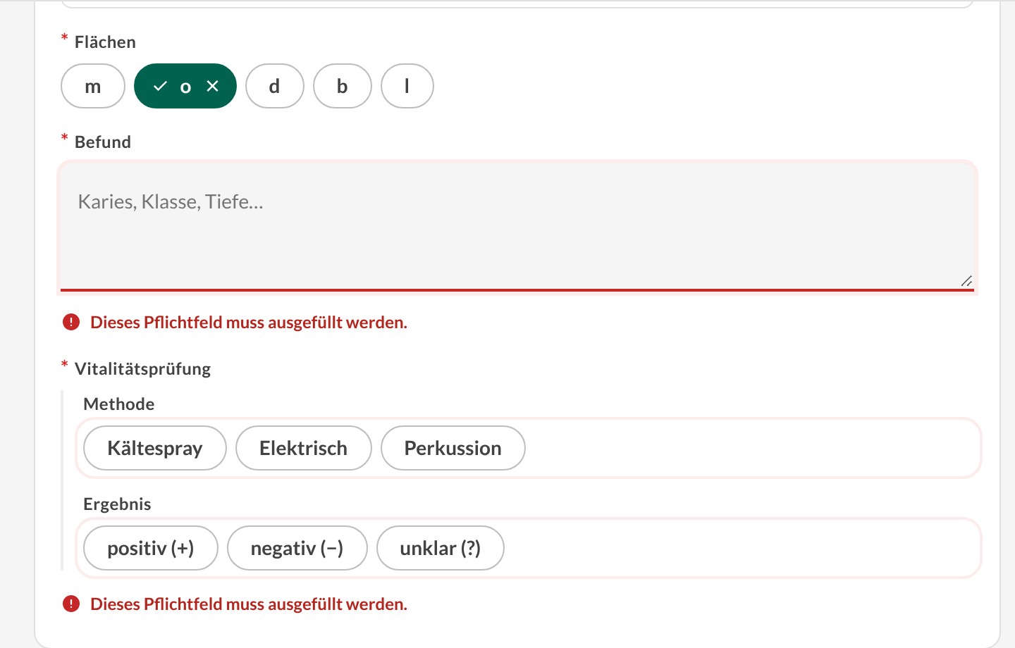
Only filled fields are copied into the patient record. If a required field is missing, the copy button takes you straight to it instead of showing a warning banner.

06

Fair insurance cues

Insurance decides which billing catalogue applies, so it's always visible as a colour on the patient number. Private and statutory patients get equal visual weight. No patient should look "premium".

Session header with patient, insurance and patient-type selectors and a compact recording bar with timer, waveform, pause and stop
A third of the screen became one control in the header: timer, live waveform, Pause, Finish.
Filling documentation with the empty required fields marked in red after trying to copy
Copy with something missing and Medlog takes you to the first gap, marked inline.
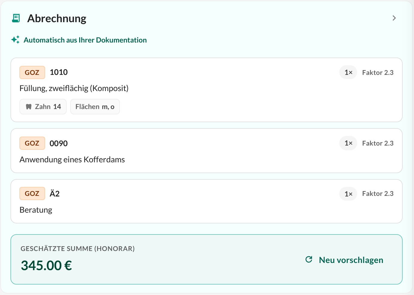
Billing panel next to a filling: three suggested GOZ positions, the filling tagged with tooth 14 and surfaces m and o, and an estimated total
Each suggested position shows where it comes from: tooth 14, surfaces m and o.
05 Mobile

Documentation first, billing directly below.

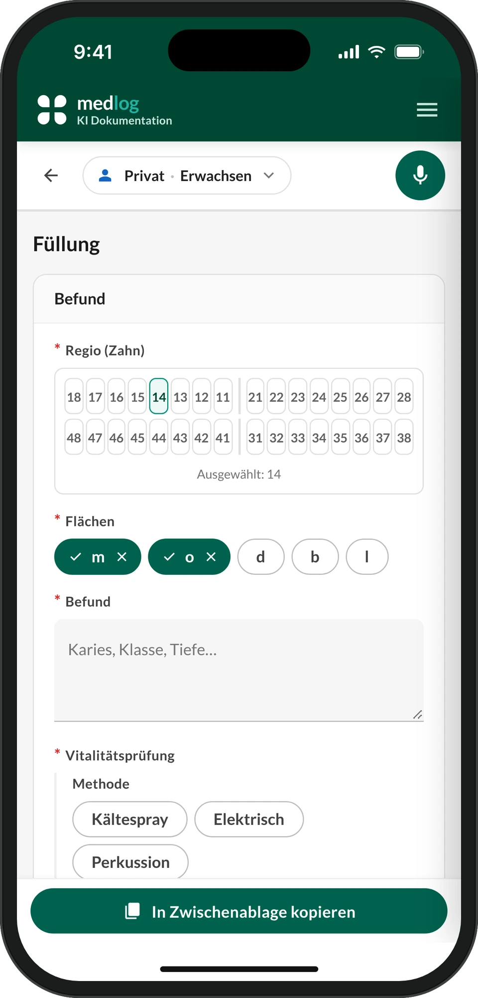
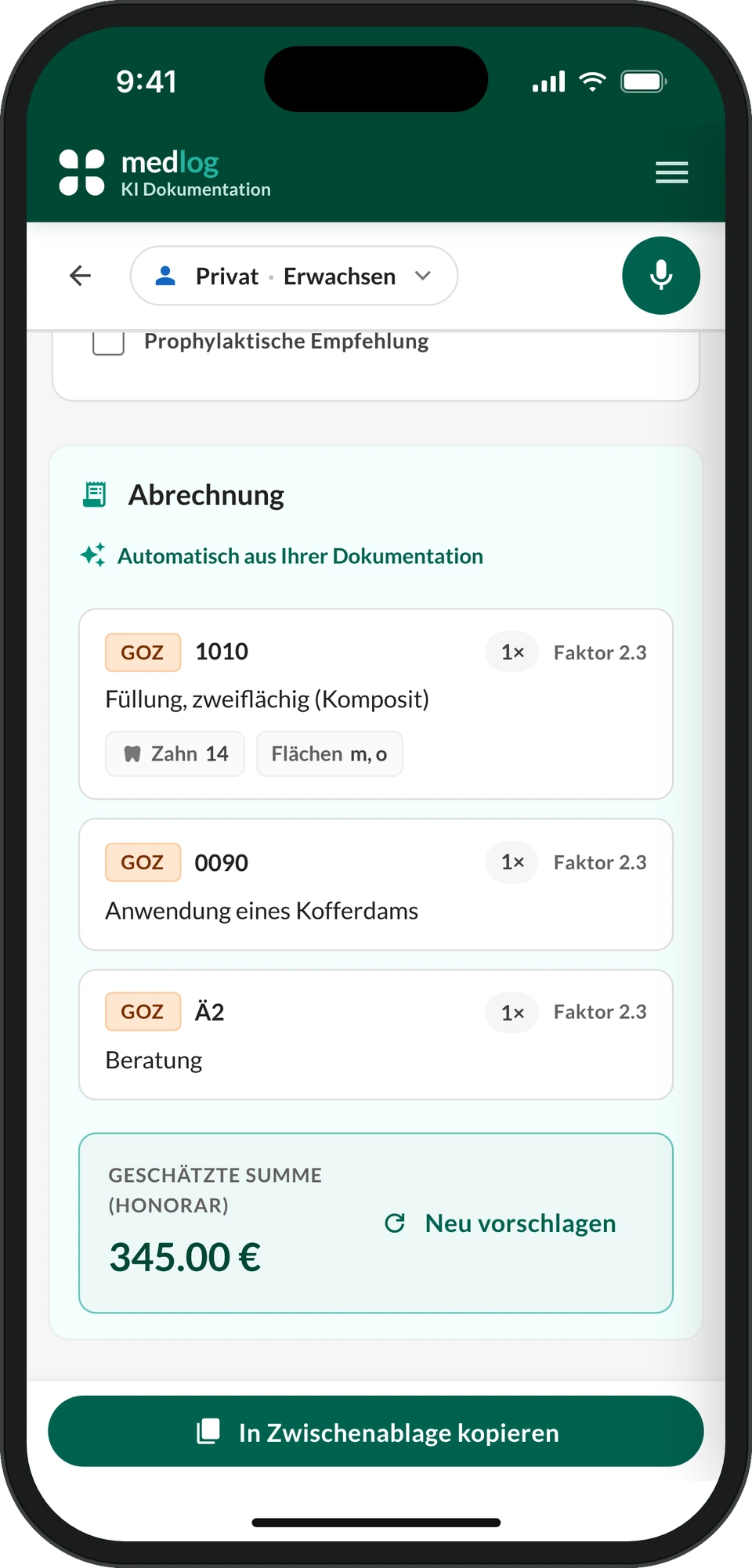
On a phone, billing stacks under the documentation and can't be collapsed. Hiding it would only hide content people need. We checked the bottom bar against the new iOS Safari layout, because for many dentists Safari is their main browser.

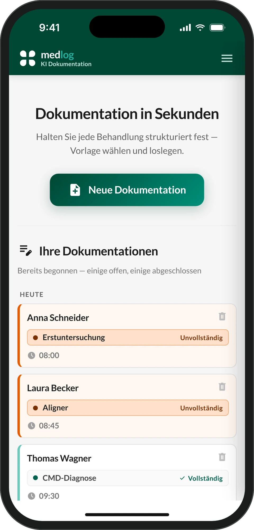
Medlog overview on an iPhone 15: today's documentation by patient name, each marked complete or incomplete Filling documentation on an iPhone 15: tooth 14 and surfaces m and o selected, copy button above the home indicator Billing positions for the filling on an iPhone 15, stacked below the documentation
06 Outcome

Live, sold beyond the network, and measured honestly.

The redesign is live in dental practices, including recording and dictation, and Medlog is now sold to external practices. I ran a task-based usability test on the redesign, recording completion, hesitations, errors and workarounds for each task:

Document a fillingDocument a treatment no template fitsEdit a frequent templateFind and reuse a template

The redesign is too recent for reliable usage data, so I won't quote a number. These are the signals that will show whether it worked:

AdoptionShare of treatments documented in Medlog. This was the original problem.
SpeedTime from end of treatment to finished documentation.
Trust in the AIShare of billing positions accepted unchanged, and corrections after review.
07 What I proposed next

The research also planned what comes after the facelift.

✓ Adopted · launching soon

The tooth chart. Many users asked to select teeth on the documentation page instead of typing codes. I designed it, but it needed backend work the brief ruled out. I kept it in the design with the evidence behind it, and it was adopted for the next version, which is launching soon.

Tooth chart in the filling template on iPhone and desktop: tooth numbers and surfaces as one-tap selections
Teeth and surfaces in one tap instead of typed codes, on phone and desktop.
Concept · not builtReasons for raised billing factors

The AI drafts the legal reason when billing staff raise a factor above the standard rate. No competitor offered this.

Concept · not builtCompleteness check

"For this treatment we'd usually expect five positions. We found four." Trust in the AI without a new billing engine.

Concept · not builtPatient context at the chair

Prior treatments and next steps during documentation. Only a product inside the practice system can offer it.

Designing AI for healthcare isn't about showing what the model can do. It's about deciding where it stops, so the people who sign the bill trust what they're signing.

Let's talk.

Senior Product Designer · Berlin
© 2026 Christy Ioannidou