The fifteen minutes nobody could see
A dentist asked for a second column in the calendar. Six months, four rounds of research and one wrong turn later, we shipped something smaller first — and let the users overrule the design we liked best.
Where it started
“Can we have a second column?”
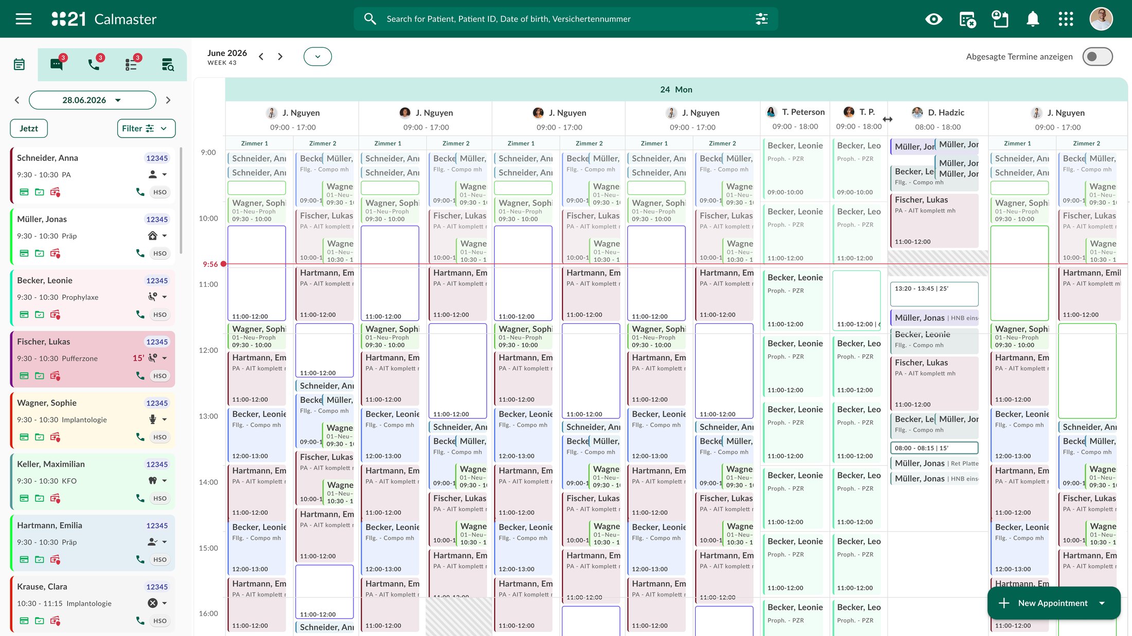
The request came from the practices. Dentists in the larger clinics wanted a second column per practitioner in the calendar — somewhere to put the appointment that runs in parallel while a long treatment is under way. It was a clear, concrete ask, and the tempting thing was to draw it.
Instead I asked why. The answer turned out to be a visibility problem, not a layout problem: reception could not see when booking in parallel was safe, so they didn’t. A long appointment renders as one solid block. Nothing on it says that for the first and last fifteen minutes — preparation, anaesthetic onset, the assistant working alone — the practitioner is genuinely free. An invisible slot is never booked.
Then priorities moved and the work was shelved. It came back in August from the business side with a different motive — the revenue in unused practitioner time — and a different proposed solution: a calendar view by rooms. Same feature, two languages, two proposed answers. Neither was the one we built.
The design stance from day one: treat the request as a symptom and go find the cause. Every later decision in this project — the cheap first step, the rejection of the room view, the choice of test method — follows from that one reframing.
Why nobody books into the big blocks
The time exists. Nobody can see it. The practice pays either way.
Take one hour-long implant appointment. The patient is in the chair for the whole hour; the dentist is needed for the middle thirty minutes. The overbookable window at each end is already configured in the practice management system — it has simply never reached the calendar screen. So only the most experienced staff book into it, from memory.
I asked the BI team for three things: every appointment with its start, end, practitioner, practice and realised revenue; the shift-planner export with its bookable / non-bookable flag; and average revenue per treatment category. Together they put hours and euros on the same axis — and they confirmed the behaviour was real.
Appointment export: 483,192 appointments, 43 practices, 14.9 months. Shift export: 354,998 shifts. Utilisation is a first estimate; the true figure is likely 43–55% because 13% of appointment activity had no matching shift record.
First answer
Two columns per practitioner, named by appointment type
The first design took the request literally: every practitioner gets two columns — “Big treatments” on one side, “Quick control” on the other — and appointments sort themselves in.
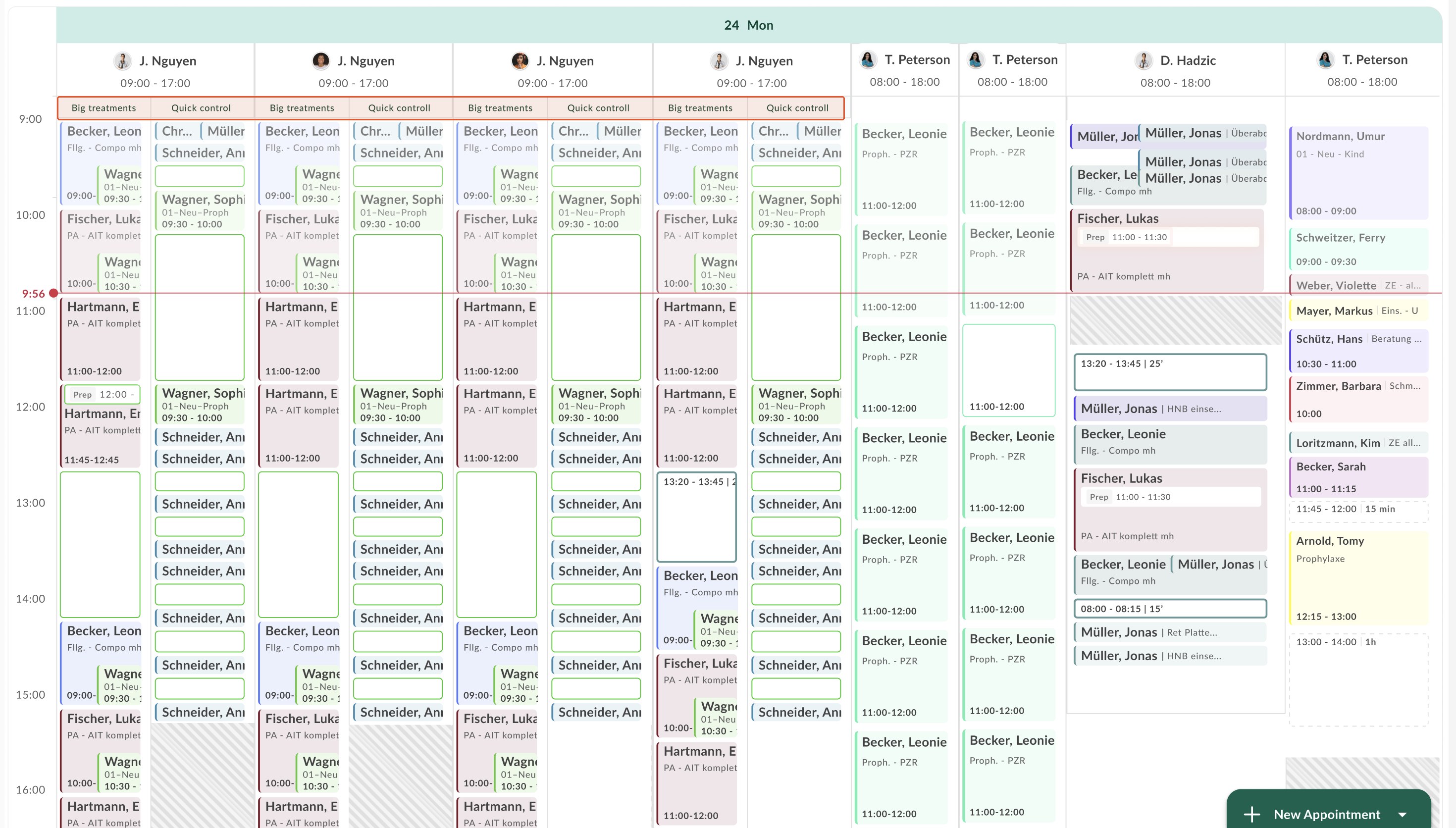
It died on two things you can only learn by drawing at real density: the columns became unreadable, and practices did not want columns named by type. What survived was the core idea — a practitioner can have more than one lane — which is now step 2 of the rollout. The design was shelved, not wrong; it was early.
Second answer
Show the free minutes inside the long appointment
If the problem is visibility, the smallest fix is to make the free time visible where it is. From July on there was one idea, drawn several ways. Round 1 asked a basic question — how does free time inside an appointment read at all? — with three renderings in front of four practice staff in a moderated session.
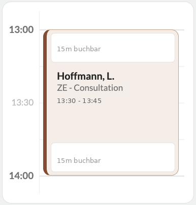
White was understood as the signal — but the window caption was tiny and grey, and the header carried the practitioner-active time, 13:30–13:45. The appointment length was not recognisable.
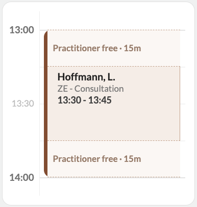
A dashed, lightened zone instead of white. A second visual language beside white; after six hours on screen such subtleties get missed.
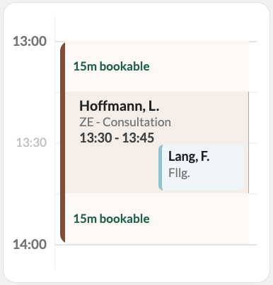
Windows in a lightened treatment colour, the booked overbooking nested inside. No clear bookable state; nested bookings read as clutter.
„Woher soll ich wissen, dass das der Termin ist, der die ganze Länge hat?“
“How am I supposed to know this is the one with the full length?” — the block showed the practitioner-active segment, not the appointment.
Reception lead · moderated session, 30 July
„Am allerbesten wäre so eine Doppelspalte, wo man das direkt sieht.“
“Best of all would be a double column where you see it directly.” The users named the remedy themselves — a column, not a colour.
Reception · moderated session, 30 July
The verdict was concept confirmed, rendering rejected. Three rules came out of it that every later version had to obey: patient time is the only time on the block; the container never visually shrinks; a booked overbooking sits beside the appointment, never nested inside it.
A fourth decision followed in early September and mattered more than it looks: one signal for “free”, and it is white — the same white that means free everywhere else in the calendar. The reduced-intensity rendering was retired not because it tested badly but because it was a second visual language for the same meaning, and a user had put it better than I could: “white indicates everything that is available.”
Closing the last question with data
Two renderings, one question that decided it
By September the idea was stable and two candidates remained. They differ in one thing: whether the treatment colour reaches the block’s true top edge. A runs three flush bands with the header below the first white band; B insets the white boxes so the colour and the left edge run the full hour. Internally, the team leaned towards A.
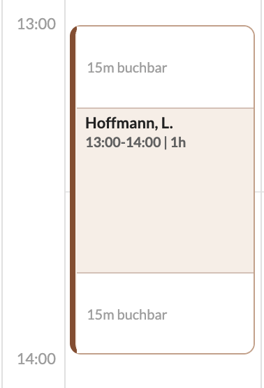
Three flush bands. The header sits below the first white band, so the colour only begins at 13:15.
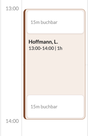
White boxes inset in the block; treatment colour and left edge run the full hour, header at the true start.
Method — and why it was built this way
A moderated session gives you why; it cannot give you which. For the final choice I ran a short questionnaire to 26 practice staff across the network — 20 reception, 4 practice management, 1 prophylaxis, 1 assistant — with four design constraints:
Identical questions for both variants
Word-for-word the same three questions, same scale, same order. It is the only thing that makes two scores comparable.
Comprehension, not preference
Not “which do you like?” but “can you tell when this appointment runs?” Preference is what lets taste win. Comprehension is what the practice pays for.
The pass mark written down first
Before the form went out: a mean below 3.5 on any comprehension question knocks the variant out, however much people like it. Set by design, in writing. That is what let the result overrule us instead of being explained away.
Within-subject, whole team
Every respondent saw both variants — I could not split a reception team in half. The trade-off is order effects; the gain is a direct paired comparison per person.
„bei A sieht aus als würde der Termin erst um 13:30 anfangen, weil die Farbe nicht bis ganz oben bei 13 Uhr geht“
“In A it looks as if the appointment only starts at 13:30, because the colour doesn’t reach the top at 13:00.” Andrea’s July complaint, returning in a different person’s words. A second respondent, weeks later and independently: “the appointment runs an hour but is only recognisable as thirty minutes.”
Survey respondents · September
Preference was split — comprehension was not. Asked which to implement: B 8, A 3, both fine 7, no preference 8. Sixteen of twenty-six had no real preference. If preference had been the deciding question there would have been no decision — or a coin flip landing on the variant that breaks in the everyday case. A did not lose on taste. It lost because it fails when something is actually booked beside it, which is the whole point of the feature.
Eleven of 26 rated A at 2 or below on that question; two rated B that low. The sample grew across five waves — 12 → 16 → 17 → 23 → 26 — and no wave reversed the sign. (Nested samples, not independent replications; I say that out loud before anyone else does.)
What the data also said, and what I did with it. Even the winner is weak on time recognition (3.69) — so a stronger appointment header and treatment colour running to both edges became mandatory refinements, not nice-to-haves. Four of 26 rejected the concept, not the variant — roughly one in seven would rather change nothing. I named that in the room rather than let someone find it.
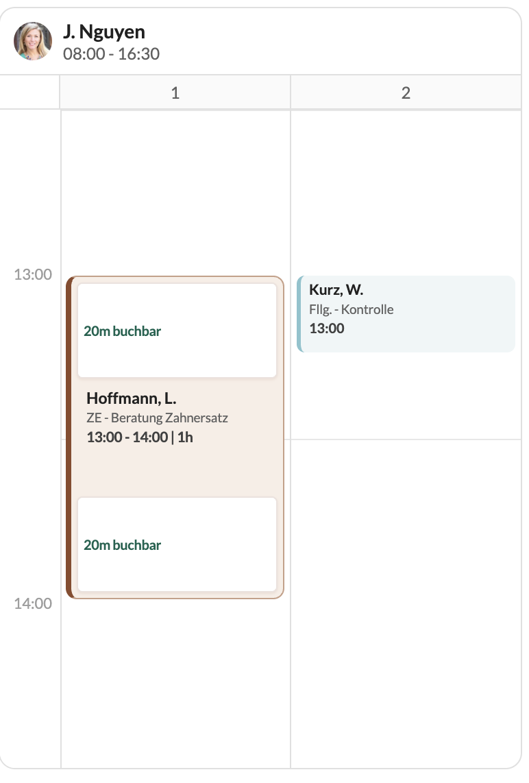
White = bookable
A white window inside the appointment marks the free time, with its duration. The same white that means free everywhere else in the calendar. No new colour, no pattern, no badge, no transparency.
The appointment never shrinks
Treatment colour and the continuous left edge run from true start to true end. The header always carries the full patient time, and the time is never shown twice.
Booked time sits beside it, never nested
A booked overbooking renders as a sibling in the second column — exactly what reception asked for in July.
Book into a window and that window is gone
Its availability disappears, including the space beside the new booking; the pair renders as a standard parallel booking. A second, untouched window stays white. Getting this rule stated precisely mattered — a looser reading would have quietly deleted the capacity the business case depends on.
The wrong turn we took deliberately
Why the second column belongs to the practitioner, not to a room
Business had asked for “a calendar view by rooms” — the model most US practice software uses. Before committing to a practitioner column as step 2, I tested the room idea as given: a room-based prototype, reviewed with three practices, plus the export.
Room names are irrelevant — “people know their rooms by habit; what matters is having more than one column.” Rejected a pure room view outright: “you’d have to figure out whose patient is whose.” What she does need is one shared second room bookable by four practitioners.
Except prophylaxis and one endodontist, nobody has a fixed room. Staff move between rooms all day; scheduling is purely by practitioner. Her organisation could not be represented in a room-based plan at all.
Only 0–5% of appointments carry a room in the three practices that book in parallel the most; 96–100% in four others. The field is optional; the spread is recording habit, not organisation. Any feature that depends on room data would fail in most practices.
Design law: columns belong to practitioners. A room is an optional label on a column — never a requirement, never a view reception has to work in. A room pivot survives only as an optional planner view for fixed-room practices. Stated honestly: of three go/no-go checks I set for room columns, only the fill rate has data behind it; the qualitative evidence carried the decision.
Sequencing as a design decision
One new idea per release
People learn a calendar once. Ship two changes at the same time and they cannot tell which one confused them. So the rollout is two steps, in an order chosen for learnability and for how soon value arrives.
Visible free time
The white window inside long appointments. No layout change — the calendar reception knows stays exactly as it is — so it ships months before the columns land. It answers the problem we opened with, and it validates the premise cheaply: if reception books into white windows, the whole idea is proven in production before anyone builds a slot engine.
The second column
A practitioner can have more than one column, so parallel work is readable instead of stacked. This is the original request, and — with type rules and a slot engine — it is what reaches the measured pool of short gaps between appointments.
The business case, correctly scoped. Inside staffed shifts there are roughly 20,000 hours a year of 10–45-minute gaps between consecutive appointments. Filling a quarter to a half of them at the realised rate for short appointment types is worth about 3–6% of annual revenue — from time that is already staffed and paid for. I made a point of saying which step that number belongs to: it is step 2 plus the engine. The inventory step 1 unlocks — the free minutes inside long appointments — was never in the export and has not been measured. That is a one-line query to BI, and I would rather say “not yet counted” than let two different pools blur into one number.
Known risk, named early. Density. A clinic runs a median of four treating practitioners at once and up to twelve; second columns apply to dentists only — median two per clinic-day, up to nine. The worst case is around twenty lanes. Flagged by a practice manager in July, a survey respondent in September and engineering in the same week. A design answer is owed before step 2 starts, and I would rather it be on the slide than in the corridor.
What I’d say about this project
The idea never changed. Users corrected the rendering four times.
The white window was on the table in July. What the research did was strip away everything around it that was wrong — the nested booking, the segment label, the second signal, the bands that let the colour stop short — and it did that because we asked comprehension questions with the pass mark written down first. The variant the team liked lost. That is the part I trust most.